If you’re scratching your head over why the decor in your home leaves you feeling slightly underwhelmed, a remedy — or at least an improvement — may be just a few moves away. Whether it’s a bland room, a paint color you’re not quite sure about or throw pillows that refuse to sit right, here are some tweaks that can help turn your questionable decorating decisions into resounding wins, along with examples of rooms that do it right. And remember that a good interior designer can help you pinpoint issues and come up with creative solutions as well.
1. Your Dark Walls Need a Lift
 Inky indigos, gunmetal grays and midnight blacks have never been more popular. If you’ve been tempted by their elegance and drama, but they’re making your room feel a little closed-in, here’s how to dump the dungeon feeling.
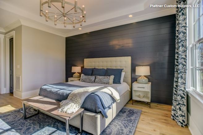
What to do: Good lighting is essential to reveal the tonal complexities in deep, saturated darks. Multiple light sources allow you to control the ambiance and light direction. Combine uplights and downlights as in this bedroom and don’t let the ceiling disappear into gloom.
Also, bear in mind that an over-furnished room will seem more cave-like than one that’s simply furnished. Clear out clutter and nonessential furniture.
“The darker the night, the brighter the stars,” Dostoyevsky wrote. Your bold move gives you the perfect excuse to indulge in rich, theatrical color contrasts. Play up dark walls with jewel tones, natural wood, reflective metallics, greenery and dramatic artwork, as in this Houston living room by Chandos Interiors.
Far from restricting a color palette, dark walls come to life when used with shades such as pale aqua and mint, silver-gray, teal, mustard, dusky pink and pumpkin yellow. And you can never go wrong with white.
Another approach is to simply surrender to your dark side and go moody and monochrome, as in this understated Scandinavian bedroom. Texture and layering are key to nailing this look. Think dusky velvets, slubby linens and sensuous silks.

2. Your Shelves Are Bursting at the Seams
Putting every ornament you own on open shelves often leads to a distracting mishmash of nondescript items. Serious sorting is needed to create some focus.
What to do: I recommend organizing-expert Marie Kondo’s life-changing advice of honoring items, then letting them go. Another motto may be “Beautiful, interesting or out.” Empty your shelves and create “yes” and “no” piles. You don’t have to throw items away, but this is a good chance to do the Kondo. The shelves seen here in this room by CAVdesign make clever use of space in a way that enhances every object.
Once you’ve reduced your candidates to the beautiful and meaningful, let them shine. You might want to paint the back of the shelves to emphasize lovely shapes and colors among your chosen collection; white items against a dark shade really stand out. Avoid highly patterned or textured backgrounds since they can be confusing to the eye.
Rather than lining books up soldier-style, stack some to form bookends and mini shelves, choosing intriguing titles and spines that coordinate with your display.

3. Your Sofa Is Pale and Interesting but Totally Impractical
You somehow forgot that a dog, a cat, two toddlers, sticky fingers, raspberry cordial and pet hair just don’t go with light sofas.
What to do: Have the fabric professionally cleaned and treated. Be aware that no stainproofing is infallible and that its effectiveness depends on the fabric. Modern formulas penetrate fibers and enable most liquid and other residue to be removed. DIY aerosol sprays are a short-term solution, but they only coat the surface and wear away after one cleaning.
We’re loving sofa throws at the moment. Drape them casually and pile on big pillows to deflect the worst of spills and grime. Another solution is to opt for slipcovers that can go in the washing machine when dirty.
If you want to leave sofas bare, vacuum often with a spotlessly clean brush attachment. In the event of a spill, blot carefully and never rub.

4. Your Vignettes Look Like Bargain Tables
Vignettes like this are a lovely way to show off treasures and create character. They’re pocket-sized portraits of your personality, so if you haven’t mastered the knack, read on.
What to do: Start with an anchor piece and build from it. Asymmetry avoids a stiff, formal look. Contrast shapes and textures. Connect with a theme, color or mood.

In this elegant vignette, angles contrast with curves, shiny and matte textures are juxtaposed, and a black-and-white palette anchors the scene. The setup is asymmetrical but, thanks to a careful arrangement, still manages to feel balanced. Best of all, it draws the observer in for a closer look.

5. Your Living Room Doesn’t Feel Friendly
We want guests to be impressed by our home’s public spaces, but often style takes precedence over comfort and we end up with a dressy living room that feels stiff and unwelcoming.
What to do: The problem may simply be in how the furniture is positioned. Seating should be arranged in a way that encourages social interaction as in this room by ACM Interiors. When deciding where to put sofas and armchairs, imagine how sitters will communicate with one another. Put seating close enough to encourage conversation rather than back against the walls, which can leave you with a no-man’s land in the center of the room.

This article first
appeared on houzz.com.
