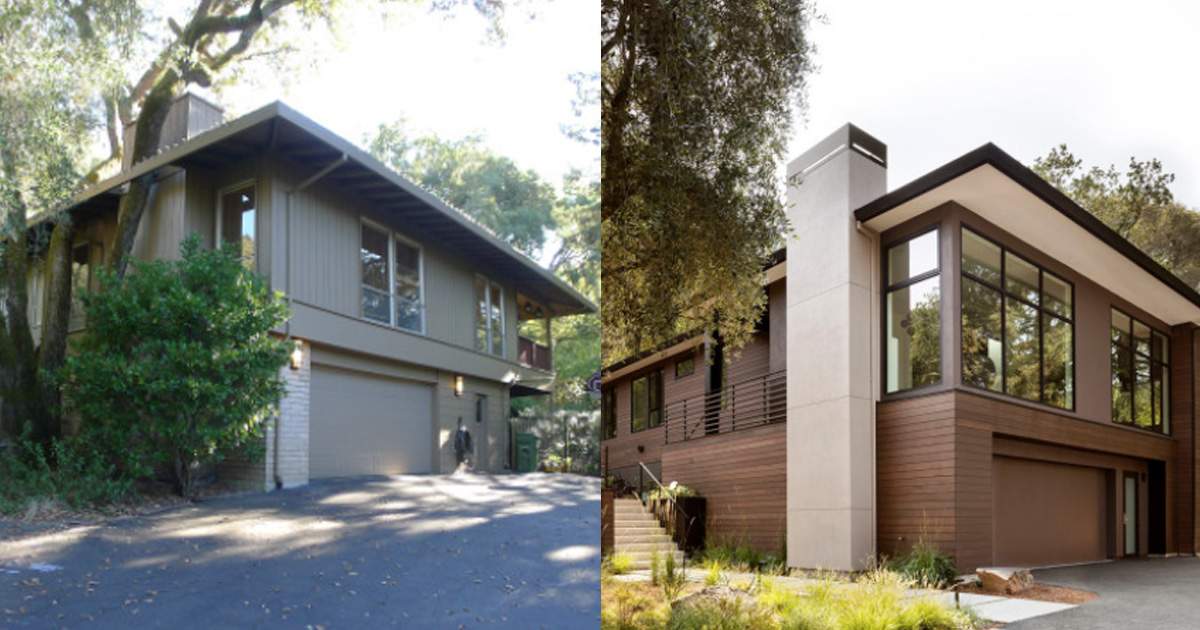
Whether you’re giving your home a minor makeover or a major face-lift, updating the exterior is a great way to make a positive first impression. The following exterior transformations range from minor (new paint and a garage door) to major (a raised roof to create a usable second floor).
Check out all five exterior makeovers, then let us know which one is the most welcoming to you.
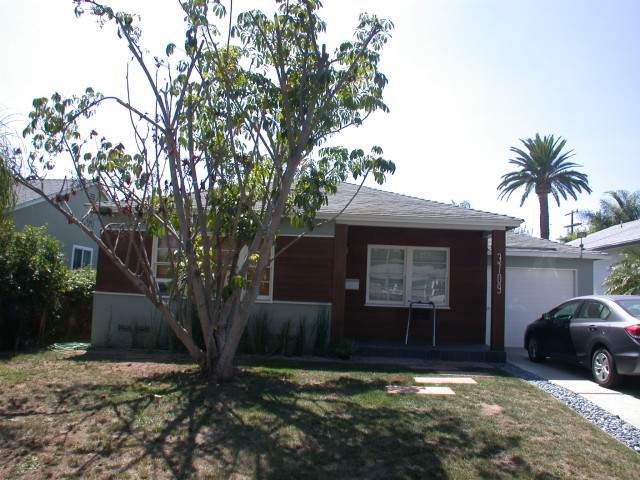
1. Bold Bungalow Makeover
Before: These Los Angeles homeowners knew it was time to refresh their 1950s bungalow. They used Houzz to search the profiles of local architects and landed on Lewis / Schoeplein Architects. The firm worked with the homeowners to completely re-imagine the interior of the house as well as give the former wood-and-stucco exterior a modern makeover with a slight industrial touch.
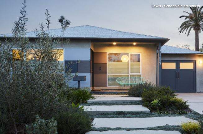
After: The exterior now features siding panels made of fiber-reinforced cement, a durable surface that comes in a variety of colors; it gives the exterior its modern industrial look. “They didn’t want a glass box. They wanted something warm. It’s something we really came together on from a design standpoint,” principal architect Toni Lewis says.
Almost everything else also is new, including the windows, mailbox and landscaping. All of the landscaping is drought-tolerant, with a focus on California native plants.
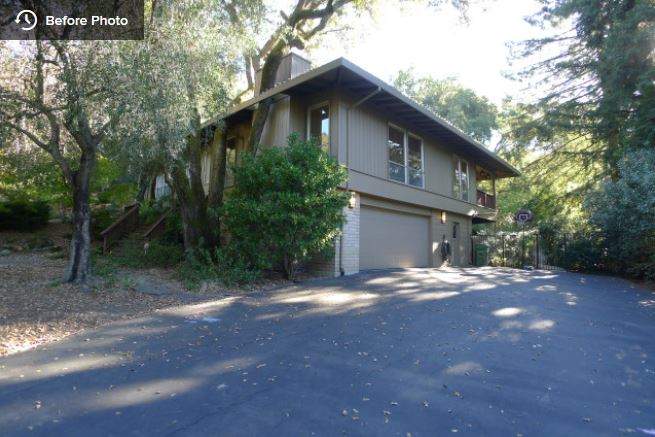
2. Wood and Windows That Wow
Before: This midcentury home in Lafayette, California, was nestled within the surrounding woodlands, but it didn’t take full advantage of its lush surroundings. The homeowners reached out to ODS Architecture to refresh the home by changing the roofline to accommodate higher ceilings, and by installing new windows and doors to provide more expansive views. The team also added a gorgeous stained wood siding on the exterior’s lower level, and stucco for the main level, chimney and overhang.
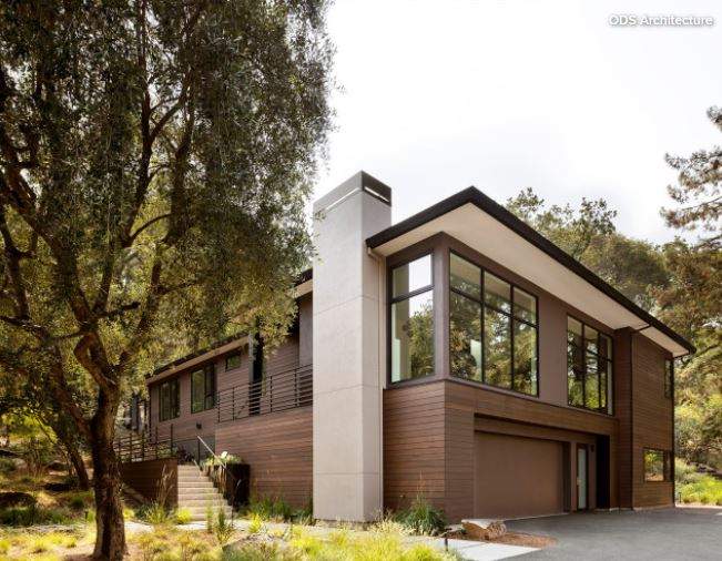
After: The bottom level of the house is now clad in stained vertical-grain western red cedar siding. The main floor’s exterior is covered in a warm dark gray stucco. A lighter stucco appears under the roof overhangs and the chimney, providing visual contrast. “With all the windows on the main floor, we needed a solid element rather than siding,” architect Alan Ohashi says. “There’s actually a lot going on in this simple-looking facade.”
3. Modern Touchup for a Midcentury Gem
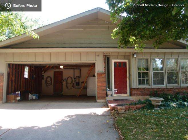
Before: Except for regular maintenance, the exterior of this Boulder, Colorado, house hadn’t changed much since it was built in 1966, in a modern ranch style that was popular for the neighborhood.
The new owners loved the home’s vintage architecture but wanted to modernize it — without losing its charm. To help with this balancing act, they worked with interior designer Kate Van Sluyter of Kimball Modern Design + Interiors, who lightened up the house inside and out.
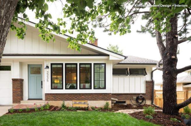
After: Newly painted siding and a new garage door and entry have updated the home while keeping the original appeal. Black-frame windows also add a modern spin, as does a spiffed-up front landscape. “We kept the original red brick trim, because that was something the new owners loved,” Van Sluyter says. “For contrast, we went with a cool blue tone for the front door.”
4. Contemporary Cool
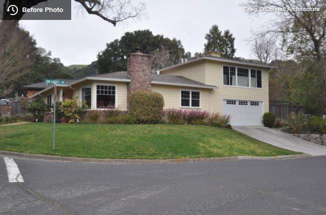
Before: After finding a house in Fairfax, California, that was ideal for their family of four, this couple hired architect Craig O’Connell to help them update it to suit their more contemporary tastes.
The plain yellow home was built in the 1950s but had a style that wasn’t exactly the midcentury modern the homeowners were looking for. “The house is basically a ranch with a rumpus room over the garage,” O’Connell says.
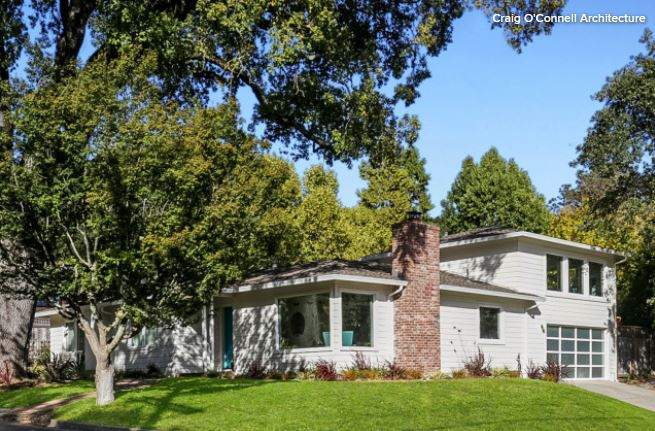
After: The biggest changes to the exterior were painting the existing siding a fresh white, replacing the windows with mullion-free fixed and casement windows, and adding a modern garage door with translucent glass panes. The original brick chimney was left untouched. New plantings around the house offer a more contemporary vibe.
5. Raise the Roof
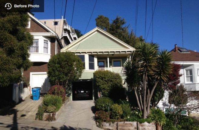
Before: This couple loved their Noe Valley neighborhood in San Francisco, but after having two kids, they found that the small, dark spaces in their 971-square-foot house weren’t conducive to a homey family life.
Architect John Lum saw potential in the Edwardian home’s roofline and backyard, and knew he could come up with something that San Francisco’s Residential Design Advisory Team would approve.
As for his clients’ approval, he used Houzz ideabooks to get a sense of their style early on in the process. “I always ask my clients to share photos and to tell us what they like and what they don’t like about them,” he says. “It really helps us zero in on a design they will like.”
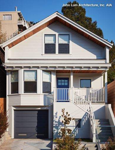
After: Lum maintained the original style of the exterior while raising the roof a few feet. He kept the gabled front, matched the new windows on the attic level to the existing windows and used the same cove siding. But he added a few modern touches, such as cedar accents, a new garage door and a brighter color palette. “These little touches indicate that there’s something else happening inside here,” he says.
This article was originally published at houzz.com.
