A kitchen of any size can feel roomy if you know a few tricks. Sticking to white cabinets and walls is a good start, but there are many other ways to create extra room in your kitchen, or create the illusion of a bigger space than you have, all without sacrificing a sense of personality. Here are 12 of my favorite ways to balance storage, style and long sightlines to get a functional layout with a spacious vibe.
1. Consider Shallow Cabinets
Here’s some outside-the-box thinking: Not all of your lower cabinets must be the standard 24-inch depth. Most cabinet lines (even stock cabinets from big box stores) also come in a 12- or 15-inch depth usually used for upper cabinets.
Using slimmer lower cabinets for one area has its advantages. It opens a bit more floor space, which can make a big difference in a tight kitchen. It also reduces your storage slightly, but often the backs of deep cabinets are hard to reach anyway, so the shallower cabinets can be just right for everyday items.
2. Reduce Your Hardware
It’s a no-brainer that eliminating counter clutter is important for keeping a kitchen looking open and breezy, but you can take this a step further by removing the hardware.
Using cabinet doors with touch-activated latches or integrated reach-in pulls reinforces the clean lines of your new kitchen, which subtly helps it appear bigger. It also gives you fewer little items to bump into or get caught on your clothing, so the space will feel easier to move in too.
3. Rethink the Double Sink
Clients often request a double sink — sometimes before anything else. Large double sinks have their uses, but if you’re willing to compromise and choose a single sink (or even a one-and-a-half sink with a slim second bowl), it can open up better storage options and more unbroken counter space.
This applies especially to stock cabinet lines, which include a limited number of size options.
If your sink is centered on the window, without a ton of room on either side, this can create a “dead zone” next to it that can’t accommodate anything. Using a smaller cabinet for the sink frees up room on either side, which can open up new options for adjacent cabinets.
For example, switching from a 36-inch sink cabinet (for a double sink) to a 24-inch cabinet (for a single sink) frees up 6 inches on both sides. This can turn 6 inches of adjacent space into 12 inches, which is enough for a usable cabinet.
If you don’t think you’ll use that second sink bowl frequently, it’s worth exploring what else that space could be used for.
4. Choose a Compact Dishwasher
Most standard dishwashers come in a 24-inch width, but compact or “condo-sized” dishwashers in an 18-inch width are growing in popularity.
Saving that 6 inches can give you a bigger cabinet elsewhere. Naturally, a smaller washer also fills up faster, which means you can run a full load more often instead of waiting a day between washes or running the machine while only half full. For smaller households this can be a perfect option.
5. Put Your Fridge on a Diet
Speaking of saving inches, choosing a slimmer refrigerator can really open up your kitchen as well. Clients usually want the largest fridge they can fit, but these large 36-inches-and-up models often end up full of clutter or simply remain half empty.
If you don’t cook often, or frequently shop for fresh produce, try slimming down your fridge to 30 inches or even 28 inches and leaving more room open for other essentials.
6. Use Panel Appliances
Not prepared to choose compact appliances? You can still get a much lighter look.
Panel-ready appliances (usually fridges and dishwashers) are designed to be able to receive a door front of your choosing so they can blend into the look of your kitchen cabinets. The resulting look is more fluid, which creates an overall larger, airier appearance. It’s usually not an inexpensive upgrade, but it definitely creates a look of sophisticated luxury.
Toronto Interior Design Group
7. Mirror Your Backsplash
When you’re tucked into the kitchen working away on dinner, that’s when the space usually feels the smallest.
Using a mirror for the backsplash opens up the sightlines, making the room seem much bigger, especially from close up. For a smart, moodier effect, use a tinted glass so the reflection is more subtle.
8. Use Shelf Uppers
In a small kitchen, removing all the upper cabinets may not be a practical option, but you can always use as much or as little as you like to house just your most attractive everyday items.
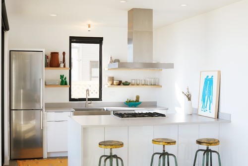
A few open shelves on one wall will perfectly hold daily-use tableware, storage jars and bins, and cookbooks, and give the room a much more open feel. It can also give a beautiful window a little more space to breathe so the whole room feels less stuffed.
Toronto Interior Design Group
You don’t even have to fully commit to shelf uppers. Try simply removing the doors from a cabinet to simulate this breezy look. You can always put the doors back on later if you want to.
9. Add Glass Door Cabinets
Here’s another way to lighten your uppers, but without actually changing your storage. Switch out typical solid cabinet fronts to doors with glass inserts to make the look much airier.
Use this cabinet to display attractive drinkware, or use frosted glass so you only get a faint peek at the mishmash of items stored within.
10. Install Cabinet Lighting
The importance of good lighting cannot be stressed enough, and in kitchens especially the lighting is often insufficient, coming just from ceiling fixtures in the center of the room. Add lighting under, above and even inside the cabinets to make the room feel much brighter and bigger, as the dark shadows around the cabinets would otherwise visually shrink the space.
For a quick fix, add plug-in LED strip fixtures or battery-powered tap lights under the cabinets for extra brightness.
11. Use a Short Backsplash
So you’ve carefully configured your storage, and now you’ve got some beautiful open wall space. To make that wall look 10 feet tall (even if it’s only 8), try using a short, minimal backsplash in a color that blends with the wall. The lack of an obvious dividing line between where the tile stops and the plain wall starts keeps the planes of the wall looking taller, so your open space looks positively vast.
Alternatively, if you have the budget, you can take tile all the way to the ceiling or use a chic slab backsplash for a truly unbroken appearance.
Try a stainless steel backsplash to present a subtle sheen that almost acts like a mirror (as discussed above), giving the room a sense of depth and echoing the finishes of steel appliances or fixtures.
12. Unwrap Your Hood
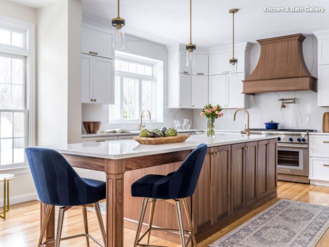
You may not want to eliminate any true upper cabinets, but the partial cabinets that wrap around a hood fan usually have little function other than hiding ductwork. Choose a beautiful range hood that is meant to be seen, and let it create a little visual break from the upper cabinets. Even this small bit of depth can make a kitchen feel less claustrophobic.
This article first
appeared on houzz.com
 Get the Tree in Water Immediately
 Keep the Tree Cool
 10. In Contrast

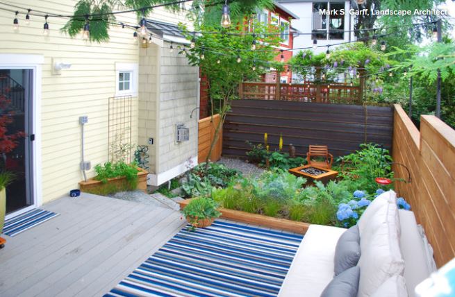
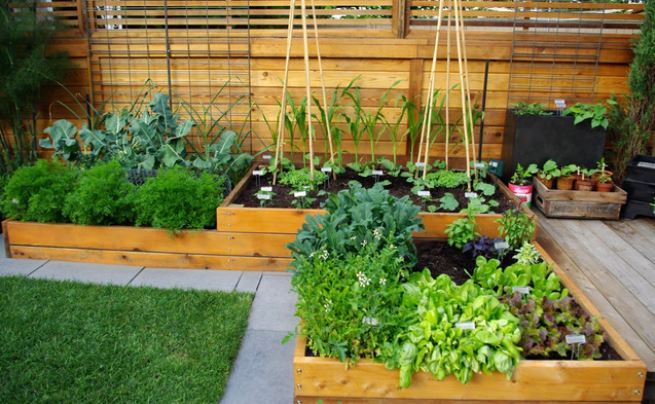 9. Vertical Veggies



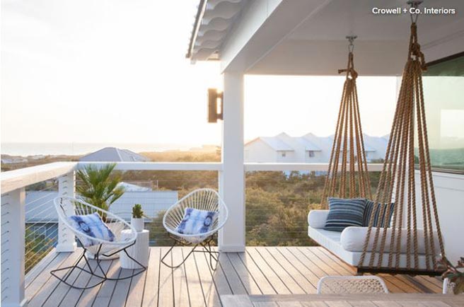
 13. Plant bee-friendly flowers. Help give pollinators a place to thrive by adding bee-friendly native plants to your garden now for fall blooms. Which flower species you choose will depend on your region; ask for assistance at a local nursery specializing in native plants if you are unsure.
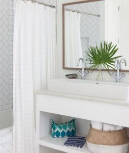 Maintenance and Extras to Do This Month
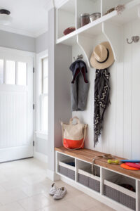 1. Get to Know Active vs. Passive Zones
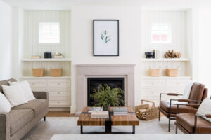
 5. Group By Task
 8. Go Vertical
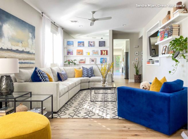
I love the idea of using an open bookcase to separate areas because it serves double duty: division and storage. Be cautious how you dress the shelves, though. I highly recommend that you do not stuff your bookcase to the gills. Leave some open space to allow brightness to filter through and highlight the objects.
Also, choose a high-quality, sturdy unit. This is not a piece to skimp on because you do not want this unit to tip over. You should always anchor and secure a freestanding unit that you’re using between spaces. Or, as in the example shown here, the bookcase unit is attached to the ceiling above and a pony wall below, ensuring it stays in place.
You could also consider a solid bookcase, which will create a more definitive separation. In that option, you could place two bookcases back to back, so you have storage on both sides or hang art on the back of one bookcase.