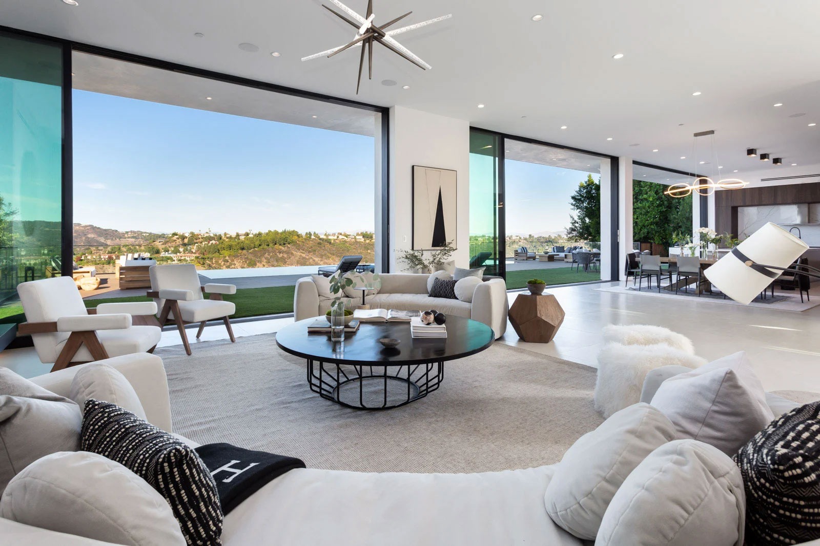
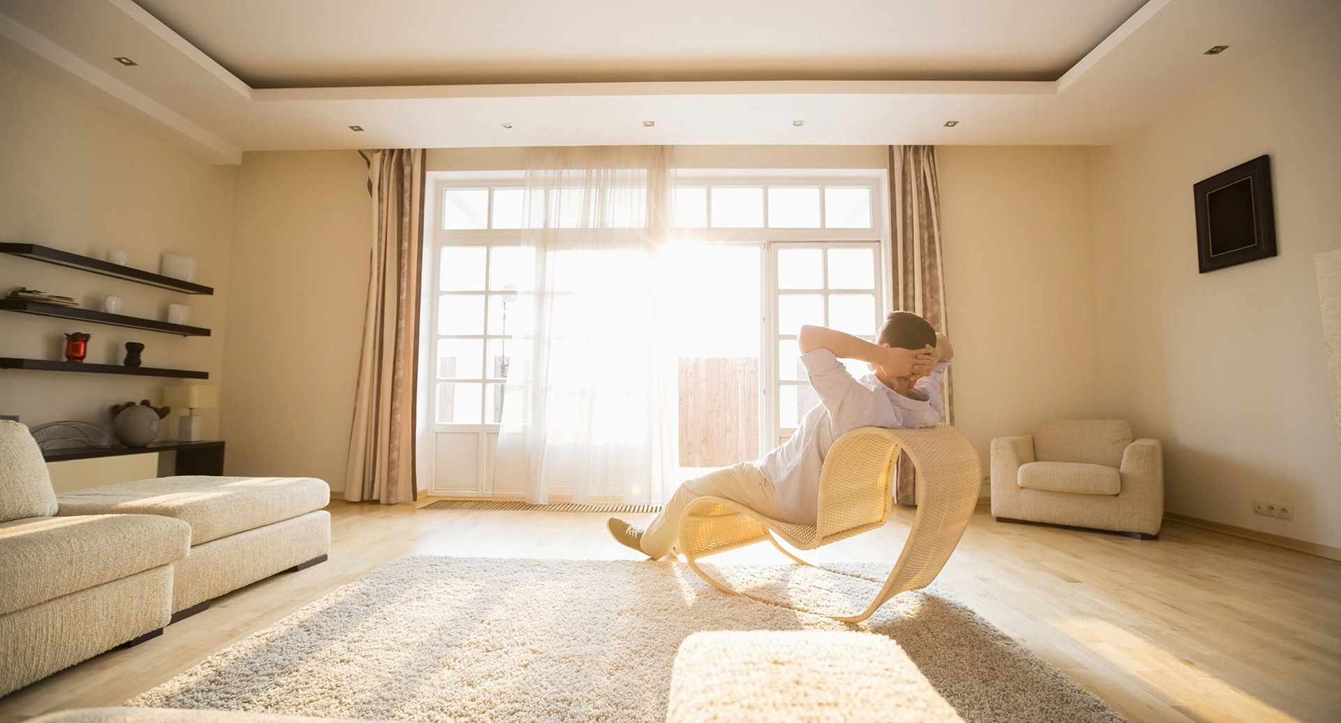
living room with white furniture and view of hills

As we (thankfully) turn the page on 2020 and welcome 2021 with hope, optimism and renewed energy, change is on the horizon. With every new year comes a chance for a clean slate, and perhaps never before has your home needed a refresh more than right now.

After staring at the same walls for almost a year, chances are you’d like a paint job, a décor tweak or maybe even a total makeover.Influenced by everything from popular fashion to ways of living, interiors take their cues from the collective pulse. New design trends are emerging every day based on necessity and circumstance—as we all learn to navigate this new normal. To make your interiors feel (un)like home in the best way possible, find inspiration from what’s new now.

The Multifunctional Home

Home has become all things to all people in it, multi-hyphenate spaces are the new norm, and especially when the design is an open-plan concept.

“The role of the home has evolved and adapted drastically—not only do we live in our homes, we now also work, exercise and even holiday in them,” said Oliver Deadman, design and product manager for the London-based Clive Christian Furniture. “No longer is the home a sacred space where one simply relaxes and unwinds, now a home must work in a multifunctional way, allowing our whole life to take place within its four walls.”

Distinctive zones in a home designed by Janet McCulley create multiple living areas. Credit: Neue Focus Photography

With spaces having to take on dual, even triple functionality, multifunctional design is more important every day. s

“This means having an office chair that is both comfortable enough for long days but aesthetically pleasing enough that it could double as a dining chair or a dining table with slim drawers that are perfect for stowing a laptop,” said Janet McCulley, of McCulley Design Lab in San Diego. .

Because most people are spending more time at home and needing a more flexible, adaptable space, Charu Gandhi, founder and director of Elicyon interior design firm based in Kensington in London, is working frequently with decorative screens that can be used to break up an open-plan space and create rooms within a room.

“Cleverly designed and placed, a screen can create layers of privacy without closing off a space completely,” she said. Screens are also a great way to add a decorative pattern or movement into a home. Ms. Gandhi is working with a variety of materials, from rich fabrics to mirrors and textured metals to create screens and dividers that double as décor.

Having a kitchen that doubles as a beautiful space to entertain family and friends is certainly a key requirement now, Mr. Christian said. “With home entertaining an increasingly popular option, our homes are required to feel warm and welcoming as well as functional,” he said.

The Statement Office Space

Working from home is all but a mainstay for most people, and as a result the idea of the home office is evolving.

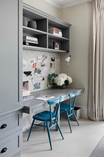
“Previously people would work occasionally from the kitchen counter or a nook in other rooms, but now they are looking to have a dedicated space for a fully functioning home office,” said Eilyn Jimenez, founder and creative director of Sire Design in Miami. These full-fledged home offices are including spaces for multiple workstations and hidden storage. “Additionally, people are now looking to have their home offices evoke a sense of calm, therefore, design has changed substantially, as we are placing greater focus on ambience and mood.”

Hidden by a sliding door, an office nook is cleverly placed in a unit at One 57 in Manhattan designed by Jeffrey Beers. Credit: Photography by Eric Laignel

Dedicated spaces for home offices allow for clear separation between working hours and family time, Ms. Landino said. “At the end of the day, it’s working from home and not living in the office that we want.”

Clients are looking at ways to repurpose and even reconfigure the spaces within their homes to once again fit in a dedicated home office.

“Tech capability combined with smart design is the ultimate requirement; clients want a room that is smart, presentable and a different tone from the rest of the house, while being equipped and highly functional,” Mr. Christian said. “They want it to feel different to aid them with balancing home and work life in the same building.”

To add depth and interest to an office, Ms. Gandhi looks to libraries and gallery settings for inspiration. She uses interesting textures such as parchment or eglomise mirror and veneers with varying tones and lacquer finishes as the backings for units. She also opts to use heavy wool fabrics for curtains. “Window dressing means you can control the daylight coming into the room, particularly if the study is south facing, so that bright sunshine doesn’t affect your screen or reading,” she said.

Ms. McCulley is designing office concepts that allow for high-functioning office areas to integrate within a variety of existing home designs—under a staircase, for example, or behind a hidden bookcase that opens to reveal a retractable desk, shelving and other elements.  She also suggests creating portable home office “kits” that can easily stow away when they need to be out of site. “This consists of a mobile desk on casters with filing units on wheels, laptop storage with cable management, mobile screens, et cetera.”

Setting a “Zoom” Stage

Virtual meetings are now as common as phone calls and as a result, the stage you set for your backdrop matters.

 “This year, many people found themselves crafting aesthetically pleasing backgrounds for video conferences,” said Mitchell Parker, an editor with Houzz, an online platform for home remodeling and design. “Through the help of Houzz inspiration photos and pros from the Houzz community, people are discovering the art of a good vignette.”

Some of the key elements include well-hung artwork, pops of color, good lighting, a little greenery and objects of different sizes that can create a stylish setting for a meeting, but also make the home office more enjoyable to be in, Mr. Parker said.

A home featured on Houzz showcases the ultimate rainbow backdrop of books. Credit: Rachel Loewen © 2019 Houzz

Lighting is another important consideration—and soft lighting is the most flattering on screen. Ms. Gandhi opts for a table lamp or floor lamp close by the computer. She also notes the power of the “shelfie”. “Clients are dressing their shelves with interesting objects and books that show their personalities during video calls,” she says. She also sets the scene with a brightly painted accent wall or artwork and considers the symmetry of it all. “If there is a spot in the home with wall lights or artwork which frame the scene, that can work very well; fresh flowers are also a great addition.”For one client who tends to do live TV segments in his office, Ms. Jimenez included a marble shelf and suiting-inspired wallpaper. “Backdrops were never a request until now and we love being able to really create unique designs in offices rather than having clients just seeing it as a space with storage and a desk,” she said.

Laid-back Living

All this quality time at home and layouts are becoming increasingly informal, Ms. Gandhi said. “People are moving away from traditional entertaining or dining spaces in favor of more laid-back living arrangements, where curved, sculptural and playful furniture works particularly well.” Sculptural furniture helps to break up a space and creates a more fluid ambience, she said.

Because of this more relaxed way of living, materials and finishes are following suit. Organic has largely replaced glam. Natural woods, industrial metals and unfinished stone are in and high-gloss brass and lacquer is out, Mr. Buckner said. “The more they live on them, the more people want their pieces to be highly functional and not precious. Comfort is key in upholstery as well as durability,” he said.

A living room designed by Charu Ghandi features soothing tones and plush furnishings. Credit: Courtesy of Elicyon

Ms. Gandhi is utilizing a lot of textured fabrics such as suede, wool and bouclé for upholstery pieces, which lend themselves to rounder, softer furniture.

“It’s also all about the placement of those pieces—a curved sofa, for example, can draw the eye to a particular view or lead you through to another room,” she said.

New neutrals composed of ivory base notes and a scattering of additional tones including rust, pink, beige, mustard and burnt orange are taking hold. “These are very liveable colors and, considering that we are all spending much more time indoors, are very fitting to the new ways in which we use our living spaces,” Ms. Gandhi said. “The new neutrals allow you to build interest and focus with highlight pieces such as cushions, rugs and chairs in bolder colors, which can be changed or rotated as required.”

Blending Inside and Out

“Clients continue to request spaces designed in a way that brings the outdoors in and often don’t want there to be a distinction between exterior and interior,” Ms. Jimenez said. “In my own home, for example, we are using bifold sliders that bring the outside indoors for a seamless transition.”

Biophilic design, a way of connecting the interior of a home to nature, is a necessity rather than just a trend, Ms. Landino said.

 “People will incorporate more glass into the interiors of their home and use sliding doors rather than solid walls to give the feeling of the outside coming in. This will also give people more access to natural light, which is something we have come to appreciate more after lockdown,” she said.

An urban pergola featured on Houzz makes the most of outdoor living. Credit Rikki Snyder © 2016 Houzz

“In good design there’s a harmonious dialogue between the exterior environment and the interior space,” said Jeffrey Beers of Jeffrey Beers International in New York. “It’s about taking inspiration from the architecture and surrounding environment and paying close attention to layout: how each space flows into the next while also ensuring the space adheres to its purpose,” he said. Mr. Beers recommends carefully chosen key materials that are timeless and durable.

Outdoor furniture used to always be an afterthought, but now, there is a huge demand for outdoor spaces to reflect the same design caliber and utility as inside the house, said Julian Buckner, CEO of Vesta Interior Design in California and Fort Lauderdale, Florida.

 “Gone are the days of just a table and chairs. People are looking to maximize their outdoor spaces with dedicated areas for dining, working, lounging and entertaining. It must evoke the same design language as the interior of the home and be just as comfortable,” he said.

Making Rooms

While open-plan living has reigned supreme, homeowners are now seeing its limitations.

“Many people are suddenly experiencing the downside of that concept: With little privacy, and even less noise control, the wall-less great room is anything but as our homes transform into multi-hyphenate spaces where we work, homeschool, exercise, cook and more,” Ms. McCulley said. “People are seeking spaces that offer the ability for quiet concentration, but the aesthetic benefit of open-flow living where light, views of the outdoors and a sense of expansiveness should not be sacrificed either,” she said.

A sophisticated living room designed by Eilyn Jimenez makes relaxing its sole purpose. Credit: Courtesy of Sire Design

Mr. Christian believes there’s been a return to distinctive living spaces.

“The idea of traveling to different rooms in the home—where different aspects of your life can take place—is reminiscent of physically traveling in our ‘normal’ lives—to the office, out for dinner, to the theater. And so now we want to reflect these journeys in our homes,” he said.

Designating separation means creating a sense of occasion when preparing a feast for friends in a spacious show kitchen with an adjoining dining room before retiring to the sitting room for after dinner drinks. Or perhaps we’re leaving the home office for the day to “travel”  to our home gym before ending the day with a family dinner around the kitchen table, Mr. Christian said. “While we may be stuck indoors for more time than we’re used to, it isn’t to say we can’t feel free and able to live like normal,” Mr. Christian said.

This article was originally published on mansionglobal.com.

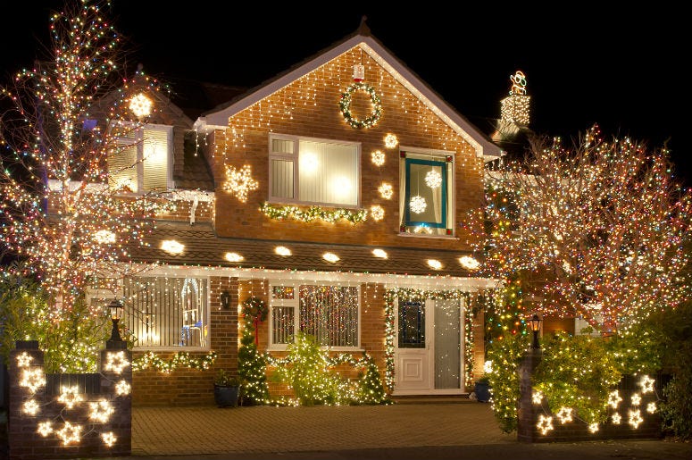
holiday lights on home

Holiday lights undoubtedly keep the season (and spirits) merry and bright through the beginning of the new year—it’s extra cheer we can all use right about now. But there’s a difference between a tasteful presentation and being the only home on the block that stands out like a disco ball gone awry.

To outfit your home in the sparkle of the season to its best advantage, follow these tips from the design pros so it’s dressed to impress in the chicest, brightest version of itself.

Make a Singular Statement

“Stick with a consistent methodology for installing the lights by following the branches on the trees with lights or by wrapping only the perimeter of the trees. Try to keep the method consistent for all the trees or bushes.

“I love white lights; they are perfect and simple. However, there are choices when it comes to white lights because string lights are now made in LED form. I always recommend using warm whites as they are closest to old-school string lights. Cool white often reads really blue and super bright. Colored lights are beautiful as well, but just keep the look consistent and follow one path rather than mixing them all together.

“If you have one show-stopper tree on your property, I always like going for it by hanging all the lights on that one tree. Pick the biggest and nicest shaped branches evenly around the tree and wrap those branches generously. You always wind up needing more lights than you think, so stock up.

“Everyone expresses their joy differently. I love a tastefully done white light display, but I also love big colorful bulbs, too. I usually change up our display from year to year and sometimes I hang colorful Moroccan lanterns in our trees and use string lights with retro large color bulbs. The key, I have found, is to pick a central pair of trees or a hedge and do a big moment there rather than scattering the lights and the applications around every hedge and tree in your yard.

Keep Things Consistent

“Lights are all about scale and proportion. Don’t hang them at random or it will look unintentional; finish whatever scale you start. If you only want to do your entryway; do just that. Next step would be another complete thought, like all your rooflines or soffits. It’s all about not leaving something halfway done. I like to hang Christmas lights on roof ridges, hips, valleys and soffits. A tasteful display around your driveway and sidewalk is always a winner if you have the entire house lit up as well.

“I prefer the classy nature of all-white lights and mixing different sizes of bulbs. I like bigger bulbs on the roof lines and smaller lights everywhere else. I like static lights for sure, but if you do use blinking, don’t put them everywhere; space them out in an even distribution.

“Lighting control is one of the easiest ways to ensure your holiday lights stay looking the way you want them to without having to plug them in every day. I use the Legrand Smart Outdoor Switch with GFCI. This Wi-Fi-connected device is perfect for managing your holiday light displays. You can control your lights with an app and set up certain schedules to your desired on and off times.”

Think About Scale

“Stick with a theme; make sure all the lights you use are the same type. Mostly it’s about making the display look tidy and not like a mess.

“Use the scale of your home as a guide and if you can’t afford to light the whole thing, think about special points of interest like a lit wreath or lit garland around the front door. Better to go bold in one or two places than to have tiny strings of lights on your eaves that don’t work there. And think about proportion—if you have a large house, for example, go big.”

Strike the Right Balance

“Holiday lights are like frosting. If you use too few, you’re left wishing there were more, or it looks like you never finished. Use too many lights and it is overwhelming. If you can strike just the right balance, they will highlight the beauty of your home and its exterior.

“I love lights intertwined with garland on the front door or draped across the front porch. This way you are using the lights to illuminate the decorations you see during the day and bringing them to life at night.”


This article first appeared on MansionGlobal.com.

Woman working from home in zoom meeting

When Ric Bucher, a tv and radio basketball commentator and author who’s a well-known face on Fox Sports activities, completed a roughly $40,000 workplace rework in his Half Moon Bay, Calif., house, he questioned if it was value it. His workspace, accomplished about three years in the past, was soundproofed, professionally wired, attractively lit, and rigged with professional-grade cameras and microphones. The concept was that if he ever wanted to file a podcast or tape a tv section from house, he might.

“It was a really costly proposition, and we requested, ‘are we doing the suitable factor?’ ” Mr. Bucher, 59, stated of conversations together with his spouse, Corrine Bucher. Then the pandemic hit. Now Mr. Bucher is ready to tape and file studio-quality segments for nationwide Fox Sports activities reveals and for his podcast. “There isn’t any query that it has been an enormous profit to my profession,” he stated.

Mr. Bucher’s renovation, with its concentrate on making him look and sound good on digicam, could have as soon as appeared particular to his distinctive occupation. However as we speak, builders and residential builders imagine that the longer term, even after the virus is below management, will contain much more earn a living from home, videoconferencing, and distant collaborating.

To accommodate this new panorama, they’re crossing out blueprints that allotted house to film theaters, recreation rooms, or lounges, and are utilizing the sq. footage for co-working areas, Zoom-call rooms, podcast recording areas and TikTok studios. They’re wiring backyard areas and pool decks with commercial-grade Wi-Fi and USB ports, and designing in-home places of work with separate entrances, soundproofing and souped-up air filtration.

And whereas some metropolis denizens are abandoning multiunit dwelling for the second, builders are betting that those that stay, and people who return, shall be drawn to a package deal of work-from-home facilities.

In downtown Los Angeles, developer Behzad Souferian’s firm purchased a 606-unit rental constructing a 12 months in the past and rebranded it because the flagship of his new BeDTLA model.

Mr. Souferian’s constructing is 95% occupied, with rents starting from about $1,800 to $3,500 a month, he stated. However he’s rebranding it to replicate what he believes are the wants of this technology of renters. By the tip of the 12 months, he’ll launch a TikTok Studio, a roughly 100-square-foot room with camera-ready lighting, tripod stand and mirrors. The small house shall be ultimate for one or two individuals to entertain themselves making TikToks—all of the extra essential “now that bars and nightlife are closed,” Mr. Souferian stated.

The constructing may even have two podcast studios. An area that was a social lounge shall be transformed into 5 to 10 work stations the place individuals will be socially distanced from others, he stated. There shall be no further cost to make use of the work-from-home facilities, he stated.

“It’s not that now we have so many podcasters and influencers in our group now, however we wish to create the services for these individuals” to draw them, Mr. Souferian stated.

Because the pandemic has developed, many constructing facilities have been closed—typically by state or municipal order, and typically by constructing managers themselves. Actual-estate corporations stated that they may adjust to rules and observe the science to find out when widespread areas can open or what sort of mitigation—equivalent to limiting capability—is smart.

Co-working house, an idea devised in a pre-Covid world, could sound ill-suited to as we speak’s surroundings. Builders stated that whereas the virus is in full power, distancing, plastic dividers and different mitigation will be deployed to make it protected.

In August, Kassie Meiler, 25, moved into the Society Las Olas constructing in Fort Lauderdale, Fla., which opened in Could. The founding father of a social-media company, she calculated that $1,895 a month for a junior one-bedroom was an excellent deal as a result of she wouldn’t should spend as much as $350 renting an workplace in a co-working constructing.

In Las Olas, Ms. Meiler leaves her unit every day to make use of a convention room for hours of Zoom calls, she stated. To date, nothing has been too crowded and she will be able to at all times discover house. She then ascends to the constructing’s Sky Garden, which is a 3,000-square-foot out of doors workplace with desks and electrical hookups on the 26th flooring.

This article first appeared on apkmetro.com.

If you’re scratching your head over why the decor in your home leaves you feeling slightly underwhelmed, a remedy — or at least an improvement — may be just a few moves away. Whether it’s a bland room, a paint color you’re not quite sure about or throw pillows that refuse to sit right, here are some tweaks that can help turn your questionable decorating decisions into resounding wins, along with examples of rooms that do it right. And remember that a good interior designer can help you pinpoint issues and come up with creative solutions as well.

1. Your Dark Walls Need a Lift

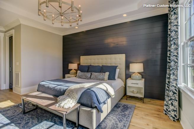
Bedroom with dark wallsInky indigos, gunmetal grays and midnight blacks have never been more popular. If you’ve been tempted by their elegance and drama, but they’re making your room feel a little closed-in, here’s how to dump the dungeon feeling.

What to do: Good lighting is essential to reveal the tonal complexities in deep, saturated darks. Multiple light sources allow you to control the ambiance and light direction. Combine uplights and downlights as in this bedroom and don’t let the ceiling disappear into gloom.

Also, bear in mind that an over-furnished room will seem more cave-like than one that’s simply furnished. Clear out clutter and nonessential furniture.

“The darker the night, the brighter the stars,” Dostoyevsky wrote. Your bold move gives you the perfect excuse to indulge in rich, theatrical color contrasts. Play up dark walls with jewel tones, natural wood, reflective metallics, greenery and dramatic artwork, as in this Houston living room by Chandos Interiors.

Far from restricting a color palette, dark walls come to life when used with shades such as pale aqua and mint, silver-gray, teal, mustard, dusky pink and pumpkin yellow. And you can never go wrong with white.

Another approach is to simply surrender to your dark side and go moody and monochrome, as in this understated Scandinavian bedroom. Texture and layering are key to nailing this look. Think dusky velvets, slubby linens and sensuous silks.

2. Your Shelves Are Bursting at the Seams

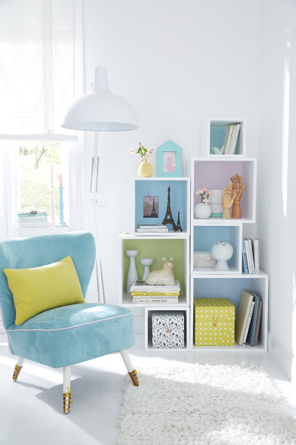
Putting every ornament you own on open shelves often leads to a distracting mishmash of nondescript items. Serious sorting is needed to create some focus.

What to do: I recommend organizing-expert Marie Kondo’s life-changing advice of honoring items, then letting them go. Another motto may be “Beautiful, interesting or out.” Empty your shelves and create “yes” and “no” piles. You don’t have to throw items away, but this is a good chance to do the Kondo. The shelves seen here in this room by CAVdesign make clever use of space in a way that enhances every object.

Once you’ve reduced your candidates to the beautiful and meaningful, let them shine. You might want to paint the back of the shelves to emphasize lovely shapes and colors among your chosen collection; white items against a dark shade really stand out. Avoid highly patterned or textured backgrounds since they can be confusing to the eye.

Rather than lining books up soldier-style, stack some to form bookends and mini shelves, choosing intriguing titles and spines that coordinate with your display.

3. Your Sofa Is Pale and Interesting but Totally Impractical

You somehow forgot that a dog, a cat, two toddlers, sticky fingers, raspberry cordial and pet hair just don’t go with light sofas.

What to do: Have the fabric professionally cleaned and treated. Be aware that no stainproofing is infallible and that its effectiveness depends on the fabric. Modern formulas penetrate fibers and enable most liquid and other residue to be removed. DIY aerosol sprays are a short-term solution, but they only coat the surface and wear away after one cleaning.

We’re loving sofa throws at the moment. Drape them casually and pile on big pillows to deflect the worst of spills and grime. Another solution is to opt for slipcovers that can go in the washing machine when dirty.

If you want to leave sofas bare, vacuum often with a spotlessly clean brush attachment. In the event of a spill, blot carefully and never rub.

4. Your Vignettes Look Like Bargain Tables

Vignettes like this are a lovely way to show off treasures and create character. They’re pocket-sized portraits of your personality, so if you haven’t mastered the knack, read on.

What to do: Start with an anchor piece and build from it. Asymmetry avoids a stiff, formal look. Contrast shapes and textures. Connect with a theme, color or mood.

In this elegant vignette, angles contrast with curves, shiny and matte textures are juxtaposed, and a black-and-white palette anchors the scene. The setup is asymmetrical but, thanks to a careful arrangement, still manages to feel balanced. Best of all, it draws the observer in for a closer look.

5. Your Living Room Doesn’t Feel Friendly

We want guests to be impressed by our home’s public spaces, but often style takes precedence over comfort and we end up with a dressy living room that feels stiff and unwelcoming.

What to do: The problem may simply be in how the furniture is positioned. Seating should be arranged in a way that encourages social interaction as in this room by ACM Interiors. When deciding where to put sofas and armchairs, imagine how sitters will communicate with one another. Put seating close enough to encourage conversation rather than back against the walls, which can leave you with a no-man’s land in the center of the room.


This article first
appeared on houzz.com.
beautiful garden with decorative lawn

If social distancing has you focusing on your property’s flora, we’re here to help with some clever gadgetry that will give you the best looking lawn and garden on the block.

Rachio 3 Smart Sprinkler Controller

Water is the source of all life, and, unsurprisingly, an integral component in keeping your lawn and gardens at their most lovely and lush, but when to water and how much? Leave the aquatic queries to the automated experts at Rachio. The Rachio 3 Smart Sprinkler Controller, which works for eight or 16 zone sprinkler systems, gives users complete, smart device-based control over their watering network, allowing them to call for water on demand or schedule regular sprinklings. Or better yet-let Rachio handle it all.

With its Weather Intelligence Plus system, Rachio can accurately read changes in weather patterns and automatically adjust when, and how much, it will water, saving homeowners expenses and removing the threat of over- or under-watering.

The Rachio 3 Smart Sprinkler Controller is available for $229 (eight-zone) or $279 (16-zone).

Landroid

A properly manicured lawn can be a tricky task, so why not move that burden onto a bot? Landroid, from tool manufacturer WORX, is a grass-eating automaton that is capable of mowing lawns up to a half-acre. Users simply lay a boundary wire around their yard-accounting for obstacles like flower beds-and Landroid takes care of the rest, chopping grass within the defined area, regardless of the weather conditions, and automatically returning to its charging pad when it is done or needs a little boost.

With the accompanying Landroid app, users can activate on-demand mowing, keep tabs on the mowing progress, set a specific mowing schedule, and even get accurate measurements of their lawn.

The Landroid is available for $999 to $1,499, depending on features and mowing area capability.

Read More…

This article first appeared on mansionglobal.com

From perfecting your lighting to ending noise pollution, here’s how to make your abode better for you.

The meaning of “home” has taken on even greater significance lately. As we’re sheltering in place, it continues to evolve as more than just a refuge—it’s a workspace, a place for homeschool, a fitness studio, and a center for entertainment, to name a few examples.

Read More…

This article was originally published on MansionGlobal.com by Jennifer Tzeses