Summer officially begins June 20 this year, but why wait until then to get into the summer spirit? Get a jump-start by prepping your home and garden for warm weather, setting up the perfect drip-dry spot for beach towels, reorganizing the kitchen (hello, smoothie bar) and more. These 21 to-dos cover all the bases, so you can enjoy the season to the fullest.
Things to Check Off Your List in an Hour or Less
1. Make your summer must-do list. Beach days, lemonade on the porch, pick-your-own fruit farms — with so much to look forward to in summer, don’t let it zip by in the blink of an eye. Be sure you are making the most of your season by creating a list of your personal must-dos and posting it where you can see it. A big chalkboard or family bulletin board would be ideal.
2. Empty standing water regularly. The best way to keep mosquito populations down is by regularly checking your property for standing water and emptying it. Even a saucer of water can become a mosquito nursery, so leave no pot unturned!
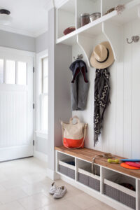
3. Set up a spot to dry beach towels and bathing suits. Soggy, sandy beach towels getting dragged through the house is a mess waiting to happen — but you can easily prevent this with a bit of planning. Choose a dedicated spot, either just outside the door (a covered porch works well) or in the mudroom, as shown, and hang a row of sturdy hooks for wet towels and bathing suits. Once dry, sand can be easily shaken off outdoors, so it doesn’t end up in your washing machine.
4. Corral summer necessities in a bowl or basket. Stash extra sunscreen, shades and bug repellant in a container near the front door for easy access when you’re in a rush.
Tackle These Tasks Over a Weekend
5. Install screen doors. If you use them, now is the time to take down the storm doors and put up screen doors to let the summer breezes pour in. Be sure to inspect screens carefully, patching holes as needed — even a tiny hole can be enough to let in a mosquito.
6. Check play equipment for safety. Over time, wood, ropes and fastenings can degrade, making outdoor play equipment potentially unsafe. Check swings, zip lines, slides and other structures for safety; repair or replace as needed.
7. Hang a clothesline for summer energy savings. While the weather is nice and warm, consider skipping the dryer and hanging your clothes to dry in the fresh air instead. It may not always be possible, but even occasionally putting a clothesline or drying rack to work will save energy.
If hang-drying isn’t an option, you can still reduce your energy bill by washing in cold water, cleaning the lint trap and having your dryer vent serviced to increase airflow.
8. Reorganize your kitchen. The change in seasons is a good time to rethink how you have things arranged in the kitchen. If there are small appliances you use more in the warmer months (a blender for smoothies, perhaps, or an ice cream maker), move them to a more accessible spot, and you will be more likely to use them.
Stations devoted to a certain purpose can also do wonders. If you have children on summer vacation, create a self-help station stocked with healthy snacks. Or create an iced-coffee bar or smoothie-making station for yourself with all needed supplies within reach.
9. Make space for summer crafts. A dedicated space for arts and crafts can provide screen-free entertainment and a creative outlet — and it’s not just for kids! Even if you must work all summer, having a space to devote to a hobby can re-energize and inspire you.
10. Organize and put away school papers. If you do have kids, at the end of the school year, it can be tempting to jump right into summer. But taking the time to sort through each child’s school things will help prevent clutter from piling up, and you can start the summer fresh. Sort through the papers, artwork and projects from the year, choosing the best representative pieces (and those that most pull at your heartstrings) to save in a portfolio or document box and then recycling the rest. If you want to preserve more than you can keep, consider scanning the artwork into your computer and creating a photo book with the pictures.
11. Keep cooling systems running smoothly. Take the time before hot weather sets in to dust ceiling fans, install window air-conditioning units and schedule maintenance for a whole-house cooling system.
12. Lighten up decor. Roll up heavy rugs, put crisp percale or cooling linen sheets on the beds and bring in accents in lighter hues for the warmer months ahead. Breezy white curtains look delightfully cool in summer, but if the weather gets quite hot where you live, you may want to leave heavy window coverings in place. Closing the shades during the heat of the day can actually help keep your house cooler.
 13. Plant bee-friendly flowers. Help give pollinators a place to thrive by adding bee-friendly native plants to your garden now for fall blooms. Which flower species you choose will depend on your region; ask for assistance at a local nursery specializing in native plants if you are unsure.
14. Keep an eye on irrigation systems. A faulty sprinkler or irrigation hose that goes unnoticed can quickly cause big problems for your lawn and garden. Make a habit of checking each component once a week, especially in summer.
15. Give your garage or shed a clean-out. Since you’ll likely be spending more time in your outdoor spaces during the summer, it’s a good idea to take some time at the start of the season to clear out space in your storage area. Take old paint cans to a hazardous waste drop-off point, sell or give away items you no longer want and organize what’s left into zones of use: garden tools and supplies, outdoor adventures and sports gear, and household tools.
16. Get seasonal gear ready. What with camping and beach trips, summertime activities come with a lot of gear. Get it cleaned up and ready now, so you’re not surprised by a leaky tent or blown-out beach umbrella when it’s too late to replace them. And if you plan to waterproof anything (tents or outdoor tablecloths, for example), now is the time.
 Maintenance and Extras to Do This Month
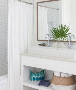
17. Refresh your bathroom. Shower curtain liner looking a little dingy? Bath towels seen better days? Give your bathroom a mini spa makeover, and swap out your tired old bath linens for fresh, fluffy new towels and a new curtain liner. Use a woven basket to corral rolled towels. And contain toiletries on a tray or in zippered containers.
18. Update first-aid kits and emergency supplies. Be prepared for everything from minor snafus to natural disasters with well-stocked first-aid kits in the house and car, plus emergency supplies for your family and pets. Not sure what to include? The American Red Cross has a helpful checklist.
19. Clean gutters and downspouts. If you did not get your gutters cleaned in spring, be sure to get this essential task checked off your list as soon as possible. Leaf- and debris-clogged gutters can lead to leaks and siding damage with summer storms.
20. Schedule major outdoor projects. Whether you are dreaming of a new patio or need to replace a deck, don’t delay booking a landscape architect or contractor for your projects. Their schedules are especially tight right now.
21. Catch up on projects and maintenance. No one is perfect, and chances are there are a few home-maintenance projects you’ve been meaning tackle. Why not make June the month to get caught up?
This article first
appeared on houzz.com.

Getting your home organized is a great feeling, but figuring out where to start can be overwhelming. Keep the process simple by zeroing in on these 10 principles of organizing, which can be applied to any space, anytime.
 1. Get to Know Active vs. Passive Zones
Active zones are the spots in your home that you pass or touch daily (usually multiple times a day), and include the entryway, top drawers and eye-level shelves and cabinets.
Passive zones are the less frequently used spaces in your home, including the guest room, garage or basement, very high and very low shelves, and nooks deep within closets.
A common organizing mistake is to clutter your prime active zones with items you don’t frequently need. For example: Don’t keep your spare lightbulbs in the top drawer in the kitchen when you only need to grab one every few months!

2. Make Open Storage Beautiful
Every home can use a combination of open and closed (i.e., hidden) storage. But what you choose to store on your open shelving should be visually pleasing. In the living room, this is a good place for books and pretty objects, not beaten-up board games and stacks of video games. Likewise in the kitchen, open shelving is the place to put your matching sets of clear drinking glasses or favorite teacups, not the plastic food storage containers.
3. Keep Things Findable
Out of sight, out of mind is an especially apt expression when it comes to organizing. Clear containers are ideal when you want to be able to see the contents at a glance, and open baskets can corral loose items while still letting you look inside.
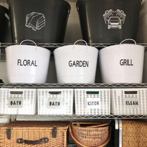
If you use containers that aren’t transparent, be sure to label them clearly — or take it a step further and label each with a photo of the objects inside. (Instant cameras are ideal for this.)
4. Make It Easy to Put Away
This is most important when it comes to kid stuff, but we can all benefit from this rule.
When you need to go get something, you’ll get it out — it doesn’t really matter where it is — but when it’s time to clean up, we all get a little lazy.
To increase the likelihood of stuff being put back in its place, use easy-to-access bins, baskets and hampers, simple filing systems, and wall hooks for frequently used items.
Are You a Piler or a Filer?
 5. Group By Task
I think of this as the first-aid kit phenomenon: When you need a Band-Aid, you may also need some antibiotic ointment, maybe some tweezers to remove a splinter, and a gauze pad; in a first-aid kit, everything you need to complete the task of caring for your injury is conveniently located in one place.
When you’re organizing your stuff, remember this and group everything you need to complete a task in the same place.
For example, you could make one box for medications, another for spare office supplies, one for holiday cookie cutters and sprinkles, and so on. Labeled shoebox-size boxes, buckets or baskets work well for grouping small items together.
6. Create a Way Station for Items In Transit
We all have a certain amount of stuff that’s constantly in transit: library books waiting to be returned, our bag and keys, the dog’s leash, the casserole dish a friend left after your last party.
Instead of allowing these random items to pile up, create a dedicated space that can handle them and keep them neat.
If you have room by the main entrance to your home, this is the most logical spot — a few baskets on a shelf and some wall hooks should do the trick.
How to Keep Your Home Neat When You Don’t Have a Mudroom
7. Subdivide and Conquer
Wide-open drawers are an invitation to clutter. Anytime you have a drawer where you’ll be storing small items, use a drawer organizer. Use them for cutlery in the kitchen, office supplies in your desk, small and useful household items in your junk drawer, and daily essentials (sunglasses, keys) in a drawer near the entry.
 8. Go Vertical
What happens when you go for something at the bottom of a pile? That’s right, it topples.
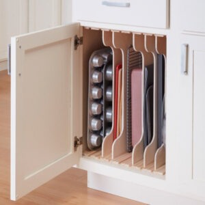
Avoid this organizing nightmare and go vertical instead. Use shelf risers to increase cabinet capacity, store sheet pans and trays in a vertical holder, and use wall-mounted holders to store brooms and mops so they won’t tip over.
9. Choose the Right Container For the Job
It can be heartbreaking to find that some of your most precious items — old family photographs, Grandma’s wedding gown — have been ruined thanks to improper storage.
Take preventative measures by choosing the right storage container for the job. Photographs and paper memorabilia should be stored in acid-free containers or albums, and textiles should be kept in breathable storage boxes or bags designed for that purpose.
10. Store Heavy Items Down Low
You should never have to balance on a stepladder while trying to lift something heavy.
Keep heavy items at or below waist height, including boxes, kitchen equipment (those dutch ovens and stand mixers weigh a ton!) and anything else that takes some real effort to lift.
And if you live in earthquake country, this is doubly important: You don’t want heavy items falling out of high cupboards and landing on someone’s head.
This article first
appeared on houzz.com.

Q. What are last minute property tax deductions I can make for my 2020 federal tax return in the U.S.?
A. For homeowners, property-related income tax deductions are limited.
Former President Donald Trump’s Tax Cuts and Jobs Act of 2017 reduced the amount of state-and-local taxes filers can deduct, according to Harvey Bezozi, a CPA and president of the Boca Raton, Florida-based company Your Financial Wizard.
“Before the Tax Cuts and Jobs Act, homeowners were able to deduct on their personal tax returns the property taxes paid for their personal residences,” he said. “[It] significantly reduced this deduction, along with the deduction for state-and-local income taxes withheld from wages, and now limits these combined deductions to a cap of $10,000.”
Politicians from states with high property taxes such as New Jersey, Illinois and California have made several attempts to work around the cap or get it repealed, but to no avail. It is set to expire at the end of 2025.
For investors, there are more options, Mr. Bezozi said.
“Rental property owners…can deduct a variety of business expenses against rental income from their properties,” he explained.
That includes everything from advertising for tenants to cleaning, maintenance and repairs, plus expenses like insurance, legal and other fees, mortgage interest and real estate taxes.
Depreciation of a rental building can also be deducted, Mr. Bezozi noted. Owners can deduct the cost of the building over 27.5 years, which can lead to tax savings.
In addition, if a rental property operated at a loss in 2020, there could be further deductions.
“If a property generates a net loss, there are rules to follow regarding whether the loss is currently deductible on the owner’s tax return, or if it must be suspended until the property is sold sometime in the future,” Mr. Bezozi explained.
These passive activity loss, or PAL, guidelines are subject to an investor’s passive income, but there are exceptions. It’s best to consult a tax expert to help navigate these rules.
This article first appeared on Mansion Global.

Even if you are not planning to sell your home anytime soon, a fresh and welcoming exterior is a wonderful thing to come home to each day. From front doors, house numbers and porch furnishings to color schemes, landscaping and basic repairs, this smorgasbord of ideas will hopefully inspire a few changes around your own home.
- Add big, bold house numbers. It’s so easy to swap out house numbers, and this one thing can make a huge impact. Echo your house style in the numbers you choose — a clean sans serif font for a modern house, hand-painted tiles for a cottage, aged copper for a Prairie-style home etc.
- Paint the front door. A front door that pops can be hugely cheering.
- Add fresh porch furniture. A pair of matching rockers, Adirondack chairs or a cozy glider is a must when you have a front porch that is visible from the street.
- Swap out porch lighting. Try replacing tiny sconces with a big, statement-making pendant light, add recessed lighting beneath the eaves or install solar lights along the front walk
- Add a hot-red accent. Red has such vibrancy; a little goes a very long way. Try a bright red bench, planter or mailbox to add zing that can be seen from across the street.
- Do some hardscaping. Built-in concrete planters, a low stone wall or new paths are all great ways to add structure to your front yard that will last for many years to come.
- Spruce up the side yard. Camouflage an eyesore with attractive fencing, clear out weeds and lay out a neat path to the backyard.
- Add depth with a fence. A low fence around a property not only adds a welcome boundary between a hectic street and a private space, but it also makes the front yard seem larger.
- Replace a lawn with flowers. Dig up part or all of your front lawn and plant perennials instead for a lush landscape that sets your house apart.
- Repair the driveway and paths. Cement, stone and pavement all can split and crack over time. Repairing or replacing damaged areas can do wonders to freshen up your home’s street view.
- Create curb appeal even in the city. When you live in the city, it can be hard to personalize your home’s exterior. Work with what you have by adding neat window planters, glossy black shutters, good lighting and clearly visible house numbers.
This article first
appeared on houzz.com
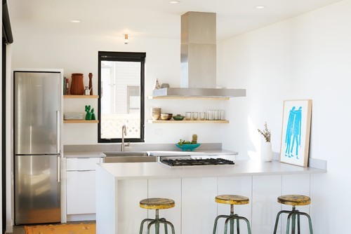
A kitchen of any size can feel roomy if you know a few tricks. Sticking to white cabinets and walls is a good start, but there are many other ways to create extra room in your kitchen, or create the illusion of a bigger space than you have, all without sacrificing a sense of personality. Here are 12 of my favorite ways to balance storage, style and long sightlines to get a functional layout with a spacious vibe.
1. Consider Shallow Cabinets
Here’s some outside-the-box thinking: Not all of your lower cabinets must be the standard 24-inch depth. Most cabinet lines (even stock cabinets from big box stores) also come in a 12- or 15-inch depth usually used for upper cabinets.
Using slimmer lower cabinets for one area has its advantages. It opens a bit more floor space, which can make a big difference in a tight kitchen. It also reduces your storage slightly, but often the backs of deep cabinets are hard to reach anyway, so the shallower cabinets can be just right for everyday items.
2. Reduce Your Hardware
It’s a no-brainer that eliminating counter clutter is important for keeping a kitchen looking open and breezy, but you can take this a step further by removing the hardware.
Using cabinet doors with touch-activated latches or integrated reach-in pulls reinforces the clean lines of your new kitchen, which subtly helps it appear bigger. It also gives you fewer little items to bump into or get caught on your clothing, so the space will feel easier to move in too.
3. Rethink the Double Sink
Clients often request a double sink — sometimes before anything else. Large double sinks have their uses, but if you’re willing to compromise and choose a single sink (or even a one-and-a-half sink with a slim second bowl), it can open up better storage options and more unbroken counter space.
This applies especially to stock cabinet lines, which include a limited number of size options.
If your sink is centered on the window, without a ton of room on either side, this can create a “dead zone” next to it that can’t accommodate anything. Using a smaller cabinet for the sink frees up room on either side, which can open up new options for adjacent cabinets.
For example, switching from a 36-inch sink cabinet (for a double sink) to a 24-inch cabinet (for a single sink) frees up 6 inches on both sides. This can turn 6 inches of adjacent space into 12 inches, which is enough for a usable cabinet.
If you don’t think you’ll use that second sink bowl frequently, it’s worth exploring what else that space could be used for.
4. Choose a Compact Dishwasher
Most standard dishwashers come in a 24-inch width, but compact or “condo-sized” dishwashers in an 18-inch width are growing in popularity.
Saving that 6 inches can give you a bigger cabinet elsewhere. Naturally, a smaller washer also fills up faster, which means you can run a full load more often instead of waiting a day between washes or running the machine while only half full. For smaller households this can be a perfect option.
5. Put Your Fridge on a Diet
Speaking of saving inches, choosing a slimmer refrigerator can really open up your kitchen as well. Clients usually want the largest fridge they can fit, but these large 36-inches-and-up models often end up full of clutter or simply remain half empty.
If you don’t cook often, or frequently shop for fresh produce, try slimming down your fridge to 30 inches or even 28 inches and leaving more room open for other essentials.
6. Use Panel Appliances
Not prepared to choose compact appliances? You can still get a much lighter look.
Panel-ready appliances (usually fridges and dishwashers) are designed to be able to receive a door front of your choosing so they can blend into the look of your kitchen cabinets. The resulting look is more fluid, which creates an overall larger, airier appearance. It’s usually not an inexpensive upgrade, but it definitely creates a look of sophisticated luxury.
Toronto Interior Design Group
7. Mirror Your Backsplash
When you’re tucked into the kitchen working away on dinner, that’s when the space usually feels the smallest.
Using a mirror for the backsplash opens up the sightlines, making the room seem much bigger, especially from close up. For a smart, moodier effect, use a tinted glass so the reflection is more subtle.
8. Use Shelf Uppers
In a small kitchen, removing all the upper cabinets may not be a practical option, but you can always use as much or as little as you like to house just your most attractive everyday items.
A few open shelves on one wall will perfectly hold daily-use tableware, storage jars and bins, and cookbooks, and give the room a much more open feel. It can also give a beautiful window a little more space to breathe so the whole room feels less stuffed.
Toronto Interior Design Group
You don’t even have to fully commit to shelf uppers. Try simply removing the doors from a cabinet to simulate this breezy look. You can always put the doors back on later if you want to.
9. Add Glass Door Cabinets
Here’s another way to lighten your uppers, but without actually changing your storage. Switch out typical solid cabinet fronts to doors with glass inserts to make the look much airier.
Use this cabinet to display attractive drinkware, or use frosted glass so you only get a faint peek at the mishmash of items stored within.
10. Install Cabinet Lighting
The importance of good lighting cannot be stressed enough, and in kitchens especially the lighting is often insufficient, coming just from ceiling fixtures in the center of the room. Add lighting under, above and even inside the cabinets to make the room feel much brighter and bigger, as the dark shadows around the cabinets would otherwise visually shrink the space.
For a quick fix, add plug-in LED strip fixtures or battery-powered tap lights under the cabinets for extra brightness.
11. Use a Short Backsplash
So you’ve carefully configured your storage, and now you’ve got some beautiful open wall space. To make that wall look 10 feet tall (even if it’s only 8), try using a short, minimal backsplash in a color that blends with the wall. The lack of an obvious dividing line between where the tile stops and the plain wall starts keeps the planes of the wall looking taller, so your open space looks positively vast.
Alternatively, if you have the budget, you can take tile all the way to the ceiling or use a chic slab backsplash for a truly unbroken appearance.
Try a stainless steel backsplash to present a subtle sheen that almost acts like a mirror (as discussed above), giving the room a sense of depth and echoing the finishes of steel appliances or fixtures.
12. Unwrap Your Hood
You may not want to eliminate any true upper cabinets, but the partial cabinets that wrap around a hood fan usually have little function other than hiding ductwork. Choose a beautiful range hood that is meant to be seen, and let it create a little visual break from the upper cabinets. Even this small bit of depth can make a kitchen feel less claustrophobic.
This article first
appeared on houzz.com
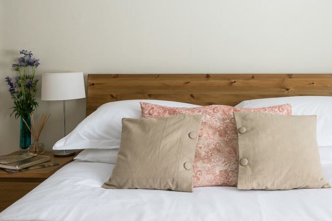
February is a time of year to indulge in home comforts like cooking big-batch meals, reading in the afternoon and watching movies with the family. Here are a dozen ideas to add to your to-do list this month, from the necessary (clearing sidewalks of snow and ice, say) to the just-for-fun (treating yourself to weekly flowers).
Things to Check Off Your List in an Hour or Less
1. Rotate your mattress. Before you put on a fresh set of sheets, take an extra minute to rotate the mattress if you haven’t done so recently. Rotating your mattress every few months will help it wear more evenly and extend its life (and comfort).
2. Pack up a bag of old sheets and towels to donate. If you bought new sheets or towels during January white sales, make some room by letting go of an old set or two. Homeless shelters and some churches will accept donations of bedding and towels in good condition, and animal shelters are often in need of towels. (Check that donations are being currently accepted.) Really worn linens can be cut up and used as rags or dropped in a textile recycling bin.
3. Clean entryway floors. If winters are cold where you are, road salt and melting snow can mean entryway floors take a beating. Pick up clutter and give the floors a good mopping.
To keep floors looking their best between cleanings, stash a few old towels in a basket near the door to wipe up messes.
4. Keep sidewalks and entryways free of ice and snow (even while you’re away). Ice and snow can make walkways dangerous for visitors. Aim to shovel snow promptly, and sprinkle gravel, straw or wood chips to provide traction. Frequent light shoveling is better than letting the snow build up. And if you plan to be away during an expected winter storm, hire someone to clear the sidewalk and front steps of your home while you’re gone. Your neighbors and mail carrier will thank you.
Tackle These Tasks Over a Weekend
5. Cook to stock up your freezer. A few hours of cooking on a weekend can produce major dividends if you focus your efforts on big-batch suppers that can be frozen and reheated later.
Knowing that you have homemade soup, stew, chili or casseroles in the freezer makes facing weeknight dinners much less stressful. Just add crusty bread and a simple salad and dinner will be ready in no time.
6. Organize bookshelves. Pull out volumes that you didn’t enjoy or are finished with and sell or donate them, leaving a bit of extra room on each shelf for new titles. And if you get distracted by beloved old books you had forgotten about, just roll with it. After all, there are few better places to spend a winter afternoon than in a comfortable chair with a good book.
7. Refresh your movie-watching zone. Winter is a good time to catch up on movies you missed in the theater or to binge-watch your favorite shows. So why not make your movie-watching zone as comfy and cozy as possible? Start by vacuuming the floors and upholstery (using a vacuum attachment) and by clearing away clutter. Next, assess your collection of movies and games, donating extras to charity. Finally, make sure there are plenty of comfortable pillows and throws and lighting that can be dimmed.
8. Boost warmth. Stay toasty and save on energy bills by blocking drafty doors with door sweeps or door snakes and warming up with rugs, throws and duvets. For even more energy savings, shut doors to unused rooms, move furniture away from heating vents and close the chimney flue when it’s not in use.
9. Check bathrooms for moisture, mildew and mold. It can be hard to give bathrooms enough ventilation when the house is closed up tight for winter.
Unfortunately, that buildup of moisture can lead to mildew or even harmful mold. Give the bathroom a thorough cleaning, paying special attention to grout, the ceiling and any other areas showing signs of excess moisture.
10. Clean the dryer vent (and check for blockages outside). Having the buildup of lint cleaned from your dryer vent at least once a year is essential to keeping your dryer working efficiently and preventing a potential dryer fire. In winter, snow can block the exterior vent, so take a walk outside your home to inspect the vent and remove snow or debris if needed.
Maintenance and Extras to Budget for This Month
11. Start planning for a spring or summer home sale. If you’re considering putting your home on the market this year, it’s a good idea to start the process now. Set a timetable, interview potential real estate agents and make a list of projects that need to get done to help your home show well.
12. Indulge in weekly fresh flowers. With Valentine’s Day happening this month, the markets will be filled with fresh flowers at good prices. Treat your home to a bouquet of fresh-cut blooms once a week to add a little cheer — spring may still be a ways off, but that doesn’t mean your dining table can’t look like a garden in bloom!
This article first
appeared on houzz.com.
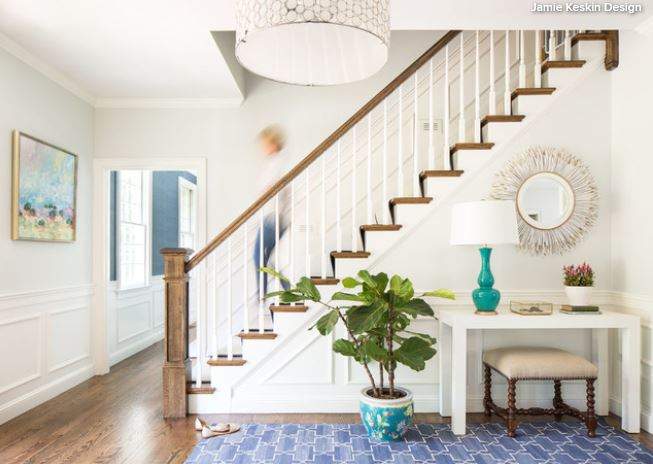
With an entire new year ahead of you, decluttering your home may not seem so hard. But after January, when that new year energy begins to wane, the prospect of tackling such a big project tends to overwhelm.
Enter this month-by-month guide to clearing the clutter from every room of your house. I’ve zeroed in on areas of the home that I find fit with certain events, such as back-to-school or spring fashion, but feel free to reorganize as you see fit to tackle specific areas of your home that need attention sooner.
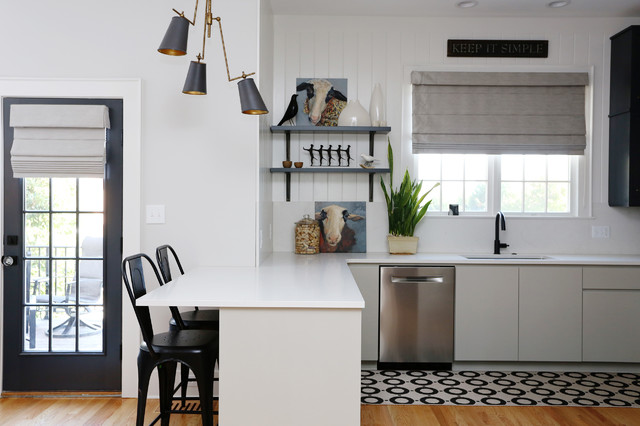
January: Kitchen and Pantry
Give yourself a fresh start for the new year with a clean kitchen, decluttered cabinets and a healthy pantry and fridge.
- Toss worn dish towels or cut them up to make rags
- Sell or give away specialty small appliances and tools you seldom or never use
- Recycle or toss freebie cups and Tupperware containers without lids
- Toss expired food and spices
- Take stock of cookware and dishes; give away or sell pieces you do not need
Habit to cultivate: Clean out the pantry and fridge each week before shopping.
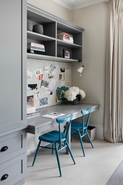
February: Home Office — Digital Documents and Papers
Get a jump-start on tax time by getting your files (paper and digital) in order.
- Sort through random stacks of paper; file, shred or recycle everything
- Streamline your files, shredding any documents you no longer need
- Use one calendar to keep track of all events
- Switch to paperless bills and statements if possible
- Clean out computer files and back up everything, using cloud-based storage and an external drive
Habit to cultivate: Sort your mail at the door, tossing junk immediately into a recycling bin.
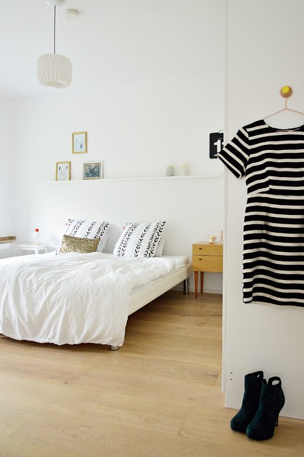
March: Clothes and Accessories
The seasonal transition is a good time to sort through clothing. Sort through winter clothes before storing, and pare back spring and summer clothes as you begin to wear them.
- Donate or sell clothes, shoes and accessories in good condition
- Have winter clothes laundered or dry-cleaned before storing until next year
- Try on all clothes for the upcoming season and give away or sell any items that do not make you feel good
Habit to cultivate: As soon as you wear something and notice it doesn’t fit, has a hole or doesn’t flatter you, toss it in a bag in your closet. When the bag is full, donate it.
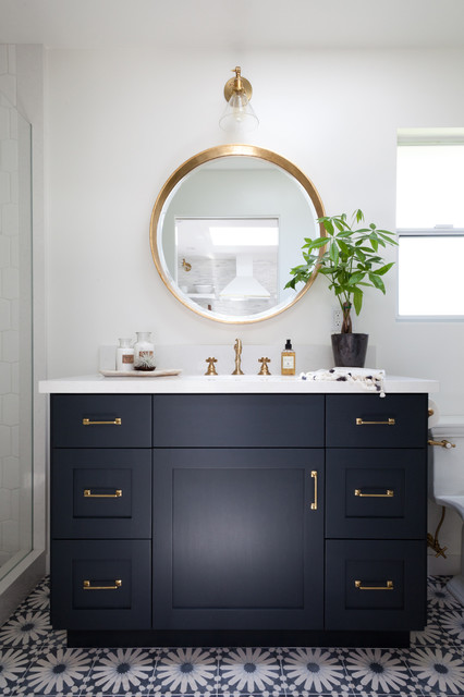
April: Bath and Beauty Products and Medicine Cabinets
Give your daily routine a spring cleaning by sorting through all of those bottles and jars hiding in medicine cabinets, on counters and in drawers.
- Toss expired makeup and skin-care items, as well as anything you do not use or like
- Clean drawers and shelves before returning items
- Store heat- and moisture-sensitive items (medications and some skin-care products) away from the bathroom
Habit to cultivate: Keep a list of your favorite bath and beauty products and order them online rather than shopping in person. This helps avoid overshopping and impulse purchases.
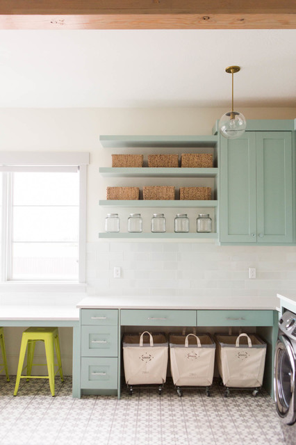
May: Laundry Room, Linen Closet, Cleaning Supplies
Cleaning routines are much easier and more pleasant when the supplies you need are neat and orderly. Sheets, towels and other household linens do not last forever — go through them this month and make some space.
- Recycle worn-out and stained towels, washcloths, sheets and tea towels at a textile recycling center.
- If your child has graduated a bed size, donate the old bedding to charity
- Clean under sinks and in any cupboards where cleaning supplies are stored. Get rid of empty containers and products you tried but did not like
Habit to cultivate: Don’t downgrade old towels and sheets to “guest” status. Only keep linens you would personally want to use — get rid of the rest. Your guests deserve better!
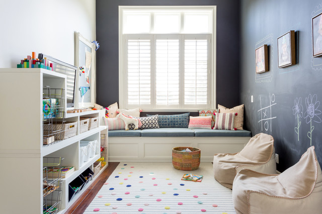
June: Family Room, Playroom, Media, Art and Schoolwork
The end of the school year is a good time to review collected artwork and school papers, and choose a small number of special pieces to save in a portfolio or document box.
- Edit schoolwork and art from the past year
- Gather a bag of DVDs, books and CDs to give away or sell
- Sort through toys and games; get rid of those your family no longer enjoys, as well as anything missing key pieces
Habit to cultivate: At the beginning of each school year, pick up a simple art portfolio. When your child brings work home, enjoy all of it for a while, but choose only a few special pieces to put in the portfolio.
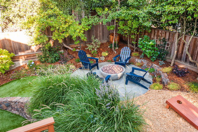
July: Yard, Shed, Garage and Tools
Being outdoors in midsummer makes this a good time to get outdoor tools and equipment in order.
- Get rid of broken tools and those you no longer need
- Sort through gardening supplies
- Toss worn-out outdoor furnishings and decor
- If you’ve been collecting items to sell, hold a yard sale this month. At the end of the day, take unsold items to a charity donation center
Habit to cultivate: Keep everything in your garage or shed on shelving, not on the floor. This helps prevent accumulating a pileup of junk and keeps your gear cleaner.
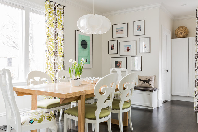
August: Photos
Photos seem to be one of the most problematic items for many people to keep organized. Use the lazy days of August to sort through old photos and make books or prints from new ones.
- Choose a few favorite photos from this year and have them framed
- Edit digital photos and back up using a cloud service as well as an external drive
- Make a photo album or book from recent photos
- Sort through any bins of loose photos and put them in acid-free photo boxes or simple albums
Habit to cultivate: Take a few extra moments to tag favorite digital photos each time you upload. Then when it’s time to print or make an album, you can go straight to your favorites.
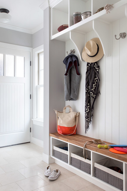
September: Mudroom, Entrances and Junk Drawers
Embrace the back-to-school spirit (whether or not you have kids) by getting the busiest zones of your house clutter-free this month.
- Put away stray items in entrances that belong elsewhere
- Add extra hooks or shelves if you need them to help corral items
- Sort through junk drawers, baskets, trays and any other spots that accumulate random junk
- Invest in drawer organizers or a wall-mounted organizer to keep small items neat
Habit to cultivate: Do an end-of-day tidy-up of the entryway, putting shoes, coats and random items back where they belong.
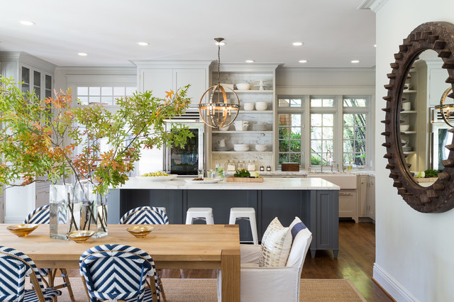
October: Dining Room and Entertaining Supplies
With the big holidays coming up over the next few months, October is a good time to get ahead of the curve and sort out your entertaining arsenal.
- Get rid of worn-out and stained tablecloths, placemats and napkins
- Count your dinnerware and serving pieces and consider whether you have enough, too much or too little for the amount you entertain
- Get rid of decor, table linens and serving pieces that you don’t like or that no longer fit your lifestyle
Habit to cultivate: Just like creating a wardrobe with lots of pieces that work together, think of creating an entertaining wardrobe that you can mix and match, rather than having lots of distinct sets of dishes.
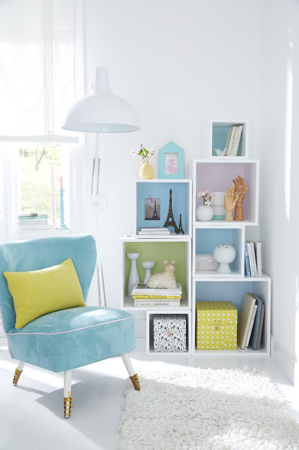
November: Hobbies and Crafts
Get ready for holiday crafting and gift wrapping by clearing out your stash and organizing supplies this month.
- Clean out gift-wrapping supplies, tossing empty tape dispensers, out-of-ink pens and shreds of gift wrap and ribbon
- Downsize your craft stash by donating spare fabric scraps, yarn, scrapbooking paper and other materials — many organizations (schools, retirement centers and the like) are happy to accept donations of craft supplies, and there are even some craft-specific donation centers, like Scrap in San Francisco
- Keep works in progress together in bags, bins or boxes
Habit to cultivate: Take the time to put away your craft supplies neatly when you are done working. A messy stash makes it more likely you will buy something you already have simply because you couldn’t find it!

December: Holiday Items and Decor
With so much going on around the holidays, it’s wise not to expect too much of yourself when it comes to clutter-clearing. That said, with all of the new gifts coming in, it does make sense to do some paring back to preserve balance in the house.
- Give away holiday ornaments and decor that you did not use this year, or that you no longer love
- Toss broken ornaments and recycle strands of lights that no longer work
- Exchange or give away gifts you received but know you will never use, and do not like — don’t keep things out of guilt. The one exception to this rule may be hand-knit sweaters. The knitter will never forgive you; that’s just how it is.
Habit to cultivate: Tell friends and family who ask (in advance of the holidays) that you and your family would prefer gifts that are experiential or edible. Most people honestly want to give you something you will like, and are happy for the guidance.
This article was originally published at houzz.com

As we (thankfully) turn the page on 2020 and welcome 2021 with hope, optimism and renewed energy, change is on the horizon. With every new year comes a chance for a clean slate, and perhaps never before has your home needed a refresh more than right now.
After staring at the same walls for almost a year, chances are you’d like a paint job, a décor tweak or maybe even a total makeover.Influenced by everything from popular fashion to ways of living, interiors take their cues from the collective pulse. New design trends are emerging every day based on necessity and circumstance—as we all learn to navigate this new normal. To make your interiors feel (un)like home in the best way possible, find inspiration from what’s new now.
The Multifunctional Home
Home has become all things to all people in it, multi-hyphenate spaces are the new norm, and especially when the design is an open-plan concept.
“The role of the home has evolved and adapted drastically—not only do we live in our homes, we now also work, exercise and even holiday in them,” said Oliver Deadman, design and product manager for the London-based Clive Christian Furniture. “No longer is the home a sacred space where one simply relaxes and unwinds, now a home must work in a multifunctional way, allowing our whole life to take place within its four walls.”

Distinctive zones in a home designed by Janet McCulley create multiple living areas. Credit: Neue Focus Photography
With spaces having to take on dual, even triple functionality, multifunctional design is more important every day. s
“This means having an office chair that is both comfortable enough for long days but aesthetically pleasing enough that it could double as a dining chair or a dining table with slim drawers that are perfect for stowing a laptop,” said Janet McCulley, of McCulley Design Lab in San Diego. .
Because most people are spending more time at home and needing a more flexible, adaptable space, Charu Gandhi, founder and director of Elicyon interior design firm based in Kensington in London, is working frequently with decorative screens that can be used to break up an open-plan space and create rooms within a room.
“Cleverly designed and placed, a screen can create layers of privacy without closing off a space completely,” she said. Screens are also a great way to add a decorative pattern or movement into a home. Ms. Gandhi is working with a variety of materials, from rich fabrics to mirrors and textured metals to create screens and dividers that double as décor.
Having a kitchen that doubles as a beautiful space to entertain family and friends is certainly a key requirement now, Mr. Christian said. “With home entertaining an increasingly popular option, our homes are required to feel warm and welcoming as well as functional,” he said.
The Statement Office Space
Working from home is all but a mainstay for most people, and as a result the idea of the home office is evolving.
“Previously people would work occasionally from the kitchen counter or a nook in other rooms, but now they are looking to have a dedicated space for a fully functioning home office,” said Eilyn Jimenez, founder and creative director of Sire Design in Miami. These full-fledged home offices are including spaces for multiple workstations and hidden storage. “Additionally, people are now looking to have their home offices evoke a sense of calm, therefore, design has changed substantially, as we are placing greater focus on ambience and mood.”

Hidden by a sliding door, an office nook is cleverly placed in a unit at One 57 in Manhattan designed by Jeffrey Beers. Credit: Photography by Eric Laignel
Dedicated spaces for home offices allow for clear separation between working hours and family time, Ms. Landino said. “At the end of the day, it’s working from home and not living in the office that we want.”
Clients are looking at ways to repurpose and even reconfigure the spaces within their homes to once again fit in a dedicated home office.
“Tech capability combined with smart design is the ultimate requirement; clients want a room that is smart, presentable and a different tone from the rest of the house, while being equipped and highly functional,” Mr. Christian said. “They want it to feel different to aid them with balancing home and work life in the same building.”
To add depth and interest to an office, Ms. Gandhi looks to libraries and gallery settings for inspiration. She uses interesting textures such as parchment or eglomise mirror and veneers with varying tones and lacquer finishes as the backings for units. She also opts to use heavy wool fabrics for curtains. “Window dressing means you can control the daylight coming into the room, particularly if the study is south facing, so that bright sunshine doesn’t affect your screen or reading,” she said.
Ms. McCulley is designing office concepts that allow for high-functioning office areas to integrate within a variety of existing home designs—under a staircase, for example, or behind a hidden bookcase that opens to reveal a retractable desk, shelving and other elements. She also suggests creating portable home office “kits” that can easily stow away when they need to be out of site. “This consists of a mobile desk on casters with filing units on wheels, laptop storage with cable management, mobile screens, et cetera.”
Setting a “Zoom” Stage
Virtual meetings are now as common as phone calls and as a result, the stage you set for your backdrop matters.
“This year, many people found themselves crafting aesthetically pleasing backgrounds for video conferences,” said Mitchell Parker, an editor with Houzz, an online platform for home remodeling and design. “Through the help of Houzz inspiration photos and pros from the Houzz community, people are discovering the art of a good vignette.”
Some of the key elements include well-hung artwork, pops of color, good lighting, a little greenery and objects of different sizes that can create a stylish setting for a meeting, but also make the home office more enjoyable to be in, Mr. Parker said.

A home featured on Houzz showcases the ultimate rainbow backdrop of books. Credit: Rachel Loewen © 2019 Houzz
Lighting is another important consideration—and soft lighting is the most flattering on screen. Ms. Gandhi opts for a table lamp or floor lamp close by the computer. She also notes the power of the “shelfie”. “Clients are dressing their shelves with interesting objects and books that show their personalities during video calls,” she says. She also sets the scene with a brightly painted accent wall or artwork and considers the symmetry of it all. “If there is a spot in the home with wall lights or artwork which frame the scene, that can work very well; fresh flowers are also a great addition.”For one client who tends to do live TV segments in his office, Ms. Jimenez included a marble shelf and suiting-inspired wallpaper. “Backdrops were never a request until now and we love being able to really create unique designs in offices rather than having clients just seeing it as a space with storage and a desk,” she said.
Laid-back Living
All this quality time at home and layouts are becoming increasingly informal, Ms. Gandhi said. “People are moving away from traditional entertaining or dining spaces in favor of more laid-back living arrangements, where curved, sculptural and playful furniture works particularly well.” Sculptural furniture helps to break up a space and creates a more fluid ambience, she said.
Because of this more relaxed way of living, materials and finishes are following suit. Organic has largely replaced glam. Natural woods, industrial metals and unfinished stone are in and high-gloss brass and lacquer is out, Mr. Buckner said. “The more they live on them, the more people want their pieces to be highly functional and not precious. Comfort is key in upholstery as well as durability,” he said.

A living room designed by Charu Ghandi features soothing tones and plush furnishings. Credit: Courtesy of Elicyon
Ms. Gandhi is utilizing a lot of textured fabrics such as suede, wool and bouclé for upholstery pieces, which lend themselves to rounder, softer furniture.
“It’s also all about the placement of those pieces—a curved sofa, for example, can draw the eye to a particular view or lead you through to another room,” she said.
New neutrals composed of ivory base notes and a scattering of additional tones including rust, pink, beige, mustard and burnt orange are taking hold. “These are very liveable colors and, considering that we are all spending much more time indoors, are very fitting to the new ways in which we use our living spaces,” Ms. Gandhi said. “The new neutrals allow you to build interest and focus with highlight pieces such as cushions, rugs and chairs in bolder colors, which can be changed or rotated as required.”
Blending Inside and Out
“Clients continue to request spaces designed in a way that brings the outdoors in and often don’t want there to be a distinction between exterior and interior,” Ms. Jimenez said. “In my own home, for example, we are using bifold sliders that bring the outside indoors for a seamless transition.”
Biophilic design, a way of connecting the interior of a home to nature, is a necessity rather than just a trend, Ms. Landino said.
“People will incorporate more glass into the interiors of their home and use sliding doors rather than solid walls to give the feeling of the outside coming in. This will also give people more access to natural light, which is something we have come to appreciate more after lockdown,” she said.

An urban pergola featured on Houzz makes the most of outdoor living. Credit Rikki Snyder © 2016 Houzz
“In good design there’s a harmonious dialogue between the exterior environment and the interior space,” said Jeffrey Beers of Jeffrey Beers International in New York. “It’s about taking inspiration from the architecture and surrounding environment and paying close attention to layout: how each space flows into the next while also ensuring the space adheres to its purpose,” he said. Mr. Beers recommends carefully chosen key materials that are timeless and durable.
Outdoor furniture used to always be an afterthought, but now, there is a huge demand for outdoor spaces to reflect the same design caliber and utility as inside the house, said Julian Buckner, CEO of Vesta Interior Design in California and Fort Lauderdale, Florida.
“Gone are the days of just a table and chairs. People are looking to maximize their outdoor spaces with dedicated areas for dining, working, lounging and entertaining. It must evoke the same design language as the interior of the home and be just as comfortable,” he said.
Making Rooms
While open-plan living has reigned supreme, homeowners are now seeing its limitations.
“Many people are suddenly experiencing the downside of that concept: With little privacy, and even less noise control, the wall-less great room is anything but as our homes transform into multi-hyphenate spaces where we work, homeschool, exercise, cook and more,” Ms. McCulley said. “People are seeking spaces that offer the ability for quiet concentration, but the aesthetic benefit of open-flow living where light, views of the outdoors and a sense of expansiveness should not be sacrificed either,” she said.

A sophisticated living room designed by Eilyn Jimenez makes relaxing its sole purpose. Credit: Courtesy of Sire Design
Mr. Christian believes there’s been a return to distinctive living spaces.
“The idea of traveling to different rooms in the home—where different aspects of your life can take place—is reminiscent of physically traveling in our ‘normal’ lives—to the office, out for dinner, to the theater. And so now we want to reflect these journeys in our homes,” he said.
Designating separation means creating a sense of occasion when preparing a feast for friends in a spacious show kitchen with an adjoining dining room before retiring to the sitting room for after dinner drinks. Or perhaps we’re leaving the home office for the day to “travel” to our home gym before ending the day with a family dinner around the kitchen table, Mr. Christian said. “While we may be stuck indoors for more time than we’re used to, it isn’t to say we can’t feel free and able to live like normal,” Mr. Christian said.
This article was originally published on mansionglobal.com.

Holiday lights undoubtedly keep the season (and spirits) merry and bright through the beginning of the new year—it’s extra cheer we can all use right about now. But there’s a difference between a tasteful presentation and being the only home on the block that stands out like a disco ball gone awry.
To outfit your home in the sparkle of the season to its best advantage, follow these tips from the design pros so it’s dressed to impress in the chicest, brightest version of itself.
Make a Singular Statement
“Stick with a consistent methodology for installing the lights by following the branches on the trees with lights or by wrapping only the perimeter of the trees. Try to keep the method consistent for all the trees or bushes.
“I love white lights; they are perfect and simple. However, there are choices when it comes to white lights because string lights are now made in LED form. I always recommend using warm whites as they are closest to old-school string lights. Cool white often reads really blue and super bright. Colored lights are beautiful as well, but just keep the look consistent and follow one path rather than mixing them all together.
“If you have one show-stopper tree on your property, I always like going for it by hanging all the lights on that one tree. Pick the biggest and nicest shaped branches evenly around the tree and wrap those branches generously. You always wind up needing more lights than you think, so stock up.
“Everyone expresses their joy differently. I love a tastefully done white light display, but I also love big colorful bulbs, too. I usually change up our display from year to year and sometimes I hang colorful Moroccan lanterns in our trees and use string lights with retro large color bulbs. The key, I have found, is to pick a central pair of trees or a hedge and do a big moment there rather than scattering the lights and the applications around every hedge and tree in your yard.
Keep Things Consistent
“Lights are all about scale and proportion. Don’t hang them at random or it will look unintentional; finish whatever scale you start. If you only want to do your entryway; do just that. Next step would be another complete thought, like all your rooflines or soffits. It’s all about not leaving something halfway done. I like to hang Christmas lights on roof ridges, hips, valleys and soffits. A tasteful display around your driveway and sidewalk is always a winner if you have the entire house lit up as well.
“I prefer the classy nature of all-white lights and mixing different sizes of bulbs. I like bigger bulbs on the roof lines and smaller lights everywhere else. I like static lights for sure, but if you do use blinking, don’t put them everywhere; space them out in an even distribution.
“Lighting control is one of the easiest ways to ensure your holiday lights stay looking the way you want them to without having to plug them in every day. I use the Legrand Smart Outdoor Switch with GFCI. This Wi-Fi-connected device is perfect for managing your holiday light displays. You can control your lights with an app and set up certain schedules to your desired on and off times.”
Think About Scale
“Stick with a theme; make sure all the lights you use are the same type. Mostly it’s about making the display look tidy and not like a mess.
“Use the scale of your home as a guide and if you can’t afford to light the whole thing, think about special points of interest like a lit wreath or lit garland around the front door. Better to go bold in one or two places than to have tiny strings of lights on your eaves that don’t work there. And think about proportion—if you have a large house, for example, go big.”
Strike the Right Balance
“Holiday lights are like frosting. If you use too few, you’re left wishing there were more, or it looks like you never finished. Use too many lights and it is overwhelming. If you can strike just the right balance, they will highlight the beauty of your home and its exterior.
“I love lights intertwined with garland on the front door or draped across the front porch. This way you are using the lights to illuminate the decorations you see during the day and bringing them to life at night.”
This article first appeared on MansionGlobal.com.

When Ric Bucher, a tv and radio basketball commentator and author who’s a well-known face on Fox Sports activities, completed a roughly $40,000 workplace rework in his Half Moon Bay, Calif., house, he questioned if it was value it. His workspace, accomplished about three years in the past, was soundproofed, professionally wired, attractively lit, and rigged with professional-grade cameras and microphones. The concept was that if he ever wanted to file a podcast or tape a tv section from house, he might.
“It was a really costly proposition, and we requested, ‘are we doing the suitable factor?’ ” Mr. Bucher, 59, stated of conversations together with his spouse, Corrine Bucher. Then the pandemic hit. Now Mr. Bucher is ready to tape and file studio-quality segments for nationwide Fox Sports activities reveals and for his podcast. “There isn’t any query that it has been an enormous profit to my profession,” he stated.
Mr. Bucher’s renovation, with its concentrate on making him look and sound good on digicam, could have as soon as appeared particular to his distinctive occupation. However as we speak, builders and residential builders imagine that the longer term, even after the virus is below management, will contain much more earn a living from home, videoconferencing, and distant collaborating.
To accommodate this new panorama, they’re crossing out blueprints that allotted house to film theaters, recreation rooms, or lounges, and are utilizing the sq. footage for co-working areas, Zoom-call rooms, podcast recording areas and TikTok studios. They’re wiring backyard areas and pool decks with commercial-grade Wi-Fi and USB ports, and designing in-home places of work with separate entrances, soundproofing and souped-up air filtration.
And whereas some metropolis denizens are abandoning multiunit dwelling for the second, builders are betting that those that stay, and people who return, shall be drawn to a package deal of work-from-home facilities.
In downtown Los Angeles, developer Behzad Souferian’s firm purchased a 606-unit rental constructing a 12 months in the past and rebranded it because the flagship of his new BeDTLA model.
Mr. Souferian’s constructing is 95% occupied, with rents starting from about $1,800 to $3,500 a month, he stated. However he’s rebranding it to replicate what he believes are the wants of this technology of renters. By the tip of the 12 months, he’ll launch a TikTok Studio, a roughly 100-square-foot room with camera-ready lighting, tripod stand and mirrors. The small house shall be ultimate for one or two individuals to entertain themselves making TikToks—all of the extra essential “now that bars and nightlife are closed,” Mr. Souferian stated.
The constructing may even have two podcast studios. An area that was a social lounge shall be transformed into 5 to 10 work stations the place individuals will be socially distanced from others, he stated. There shall be no further cost to make use of the work-from-home facilities, he stated.
“It’s not that now we have so many podcasters and influencers in our group now, however we wish to create the services for these individuals” to draw them, Mr. Souferian stated.
Because the pandemic has developed, many constructing facilities have been closed—typically by state or municipal order, and typically by constructing managers themselves. Actual-estate corporations stated that they may adjust to rules and observe the science to find out when widespread areas can open or what sort of mitigation—equivalent to limiting capability—is smart.
Co-working house, an idea devised in a pre-Covid world, could sound ill-suited to as we speak’s surroundings. Builders stated that whereas the virus is in full power, distancing, plastic dividers and different mitigation will be deployed to make it protected.
In August, Kassie Meiler, 25, moved into the Society Las Olas constructing in Fort Lauderdale, Fla., which opened in Could. The founding father of a social-media company, she calculated that $1,895 a month for a junior one-bedroom was an excellent deal as a result of she wouldn’t should spend as much as $350 renting an workplace in a co-working constructing.
In Las Olas, Ms. Meiler leaves her unit every day to make use of a convention room for hours of Zoom calls, she stated. To date, nothing has been too crowded and she will be able to at all times discover house. She then ascends to the constructing’s Sky Garden, which is a 3,000-square-foot out of doors workplace with desks and electrical hookups on the 26th flooring.
This article first appeared on apkmetro.com.

Getting Started: Turbocharge Your Decluttering
If you’re feeling inspired and motivated by the new year, take advantage of that energy and spend a few weekends clearing clutter throughout the house. Making noticeable headway will help motivate you to keep up the decluttering effort in the coming months. Try to get the other members of your household onboard — but if they are not interested, don’t try to force it. Hopefully they will see the positive changes happening around the house and change their tune!
Habit to cultivate: Keep an empty reusable bin in a closet, and use it to corral items you plan to give away.