“Open-plan layout” is a generic term used in interior design and architecture for any floor plan that makes use of large, open spaces and minimizes the use of small, enclosed rooms. They are, for the most part, free of interior walls or partitions. Open floor plans became popular in the 1970s, but over the past year, as people have been isolated at home, all that openness is causing some to reconsider. It turns out those walls, partitions and other barriers are useful for minimizing noise and giving a visual and physical sense of privacy. Here are 15 ways you can create that separation in an open floor plan.
1. Arrange the Furniture
This is definitely the place to start when it comes to defining zones for your interior, and it likely won’t cost you a thing.
Turning the backs of chairs and sofas to the rest of a space is an immediate way to signal a separate area. Rearranging your furniture to carefully create cordoned intimate sections may be the most powerful tip for redefining an open layout.
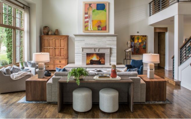
For example, if your living room is alongside your dining room, make sure your sofa has its back to the table or that your chairs are facing the fireplace, like in the space shown here. This will create a notion of separateness.
Having textured portions of wall, like the dramatic stone fireplace here, also helps visually signal different areas.
Adding surfaces behind furniture zones can also create a barrier. A console table behind a sofa, like shown here, is a nice way to add height and definition.
The more height you add to your console table in terms of accessories and items you place on the surface, the more of a visual barrier you’ll create. Consider tall vases, high stacks of books and table lamps.
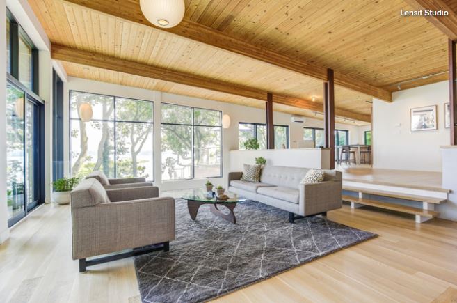
2. Add an Area Rug
Another strong way to create a visually distinct area is through the placement of rugs on floor surfaces. They also enhance your decor and add softness to the overall space. Rugs are also great for absorbing noise, which is helpful when multiple activities are happening in one space.
Be sure you select a rug that is the appropriate size. It should at least fit the main piece of furniture, such as a sofa, on it.
If you’re unsure on what style of rug to go for, my recommendation would be a bold pop of color to really define the zone and give it a radically different personality.
3. Introduce a Folding Screen
One low-commitment way to divide a space is with a decorative folding screen. These vertical barrier pieces can also inject pattern and color into a room. And they can be easily moved around to other areas of the home or taken out completely when you’re ready for a full open floor plan again.
Notice how the screen here creates an intimate seating area while adding color and pattern. The striking light fixture carries weight and also helps define this space. At night, the light will punctuate the zone even more.
4. Accent the Ceiling
Sometimes the best ideas come from above. The inset ceiling in this living room is dressed in wallpaper and finished with multiple bulb lights. This feature stylishly characterizes the sitting area.
For a more subtle but still effective approach, consider enhancing a ceiling with paint or molding

Curtains can go far beyond just dressing your windows. They can make a plush room divider too. It’s a look that will create softness and enhance a room’s ambiance. But because there’s no standard size curtain and rod for a room application, going custom is probably the best route.
A stylish fixed screen divider is an elegant way to break up a room. It can also add an arty feature to your space. Consider your surrounding design and architectural elements when selecting the pattern, color and material for a fixed screen. You want it to feel intentional, as if the divider was always part of the space rather than an afterthought.
Here, classic midcentury modern-style breeze blocks coordinate with the Eames-style dowel leg chairs and other midcentury-inspired details.
A large leafy green tree can add a lively optical barrier. The ficus tree in this home in Austin, Texas, helps separate a living area from a dining spot. Also, notice how the homeowners painted a single wall on the left a different color than the other walls to signify a transition space.
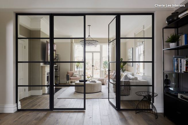
A glass partition helps block noise while letting light pass between spaces. If you want to obscure the view to further separate rooms, consider etched or textured glass.
It might seem counterintuitive to put up a wall where one was previously taken down or add one to a new-build home intended to be open, but sometimes you have to be honest about how you use your home and what your needs are.
And you don’t have to add a full wall. Sometimes a pony wall or a partition wall like the orange one shown here that stops just short of the ceiling is enough. Plus, a simple non-load-bearing wall made with two-by-fours and drywall is relatively easy to put up and take down.
Changing the level of a room or creating a sunken room is a method that will definitively separate spaces within an open layout. A level change down from a main floor area can offer increased headroom and a feeling of spaciousness. A level change up will create a more intimate space.
Keep in mind that level changes in homes can be difficult to navigate for people with mobility issues, so always consider handrails or other support structures.
If your kitchen feels too open to surrounding rooms, like if you’re trying to cook and guests or family members keep coming in and getting in the way, investing in an island could be right for you.
An island forms a barrier that keeps people on one side and the chef on the other. It also visually denotes the separation of spaces. Counter stools will further highlight the boundary point, but also consider placing a small beverage fridge on the outer side or end to let guests grab a drink without needing to come fully into the kitchen to the main fridge and potentially get in the way of the cook.
For a less permanent option, consider an island on casters that can be locked or unlocked, allowing you to push the piece out of the way to create a more open feel as needed.
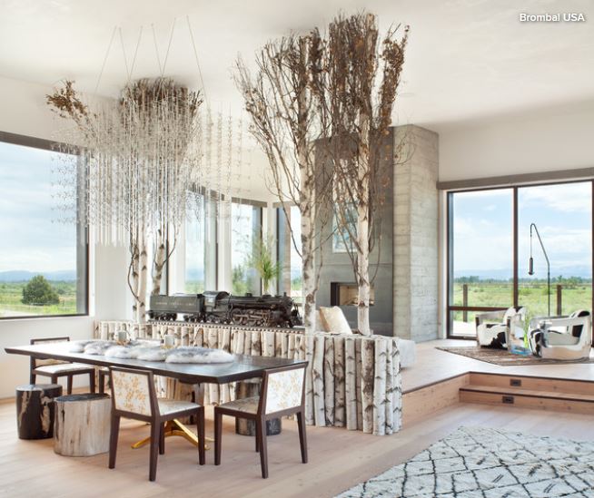
If you lack wall space to hang artwork because of an abundance of windows (not a bad problem to have), consider creating, or hiring an artist to create, an art installation that separates rooms.
In this Montana home, an installation of what appears to be birch trees and trunks cordons off the dining area from the living room. Also, notice how the level change defines the spaces, as does the large light fixture over the dining table.
Sliding doors are popular for fully opening up interiors to outdoor spaces, but the concept can just as easily be applied to interior spaces.
In this San Francisco home, sliding panels can completely shut off or open up a workspace to the main living areas.
For this arrangement, you need bulkheads or another system for supporting the tracks from which the panels hang. If tracks are going in the floor, that’s something that will require extra thought and planning. Also, keep in mind that some setups might be more difficult to clean than others, so it’s worth doing your homework. If the panels permanently overlap, for example, it can be hard to clean the space between them. If the tracks are on the floor, dirt and other debris can settle in the nooks.
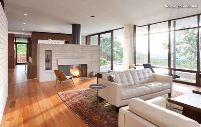
A two-sided fireplace is perhaps the coziest and most inviting option of the bunch. Fireplaces always create a striking focal point, and a two-sided option has the advantage of distributing heat and ambiance more evenly to two areas than if it was against one wall at the end of a large open room.
You can also consider bio-ethanol or electric options that don’t require a chimney.
This article was originally
published on houzz.com.
I love the idea of using an open bookcase to separate areas because it serves double duty: division and storage. Be cautious how you dress the shelves, though. I highly recommend that you do not stuff your bookcase to the gills. Leave some open space to allow brightness to filter through and highlight the objects.
Also, choose a high-quality, sturdy unit. This is not a piece to skimp on because you do not want this unit to tip over. You should always anchor and secure a freestanding unit that you’re using between spaces. Or, as in the example shown here, the bookcase unit is attached to the ceiling above and a pony wall below, ensuring it stays in place.
You could also consider a solid bookcase, which will create a more definitive separation. In that option, you could place two bookcases back to back, so you have storage on both sides or hang art on the back of one bookcase.